Ru
Ru Our channel
Flomni: website
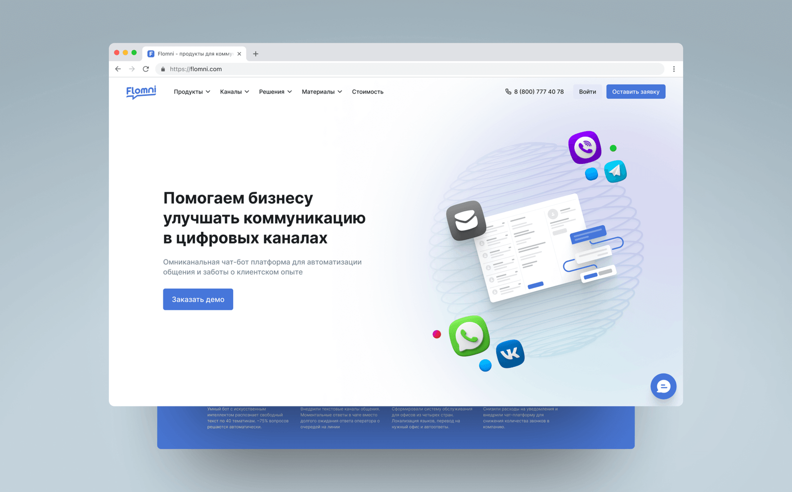
As part of the project, we created a unified design system that simplified website scaling and accelerated the launch of new pages. We also developed interactive prototypes for handoff to development and updated the company's brand identity.
Tasks
— Redesign the main website
— Lay the foundation for further company rebranding
Features
— Focus on mobile version
— 40+ pages
— SEO recommendations taken into account
Implementation
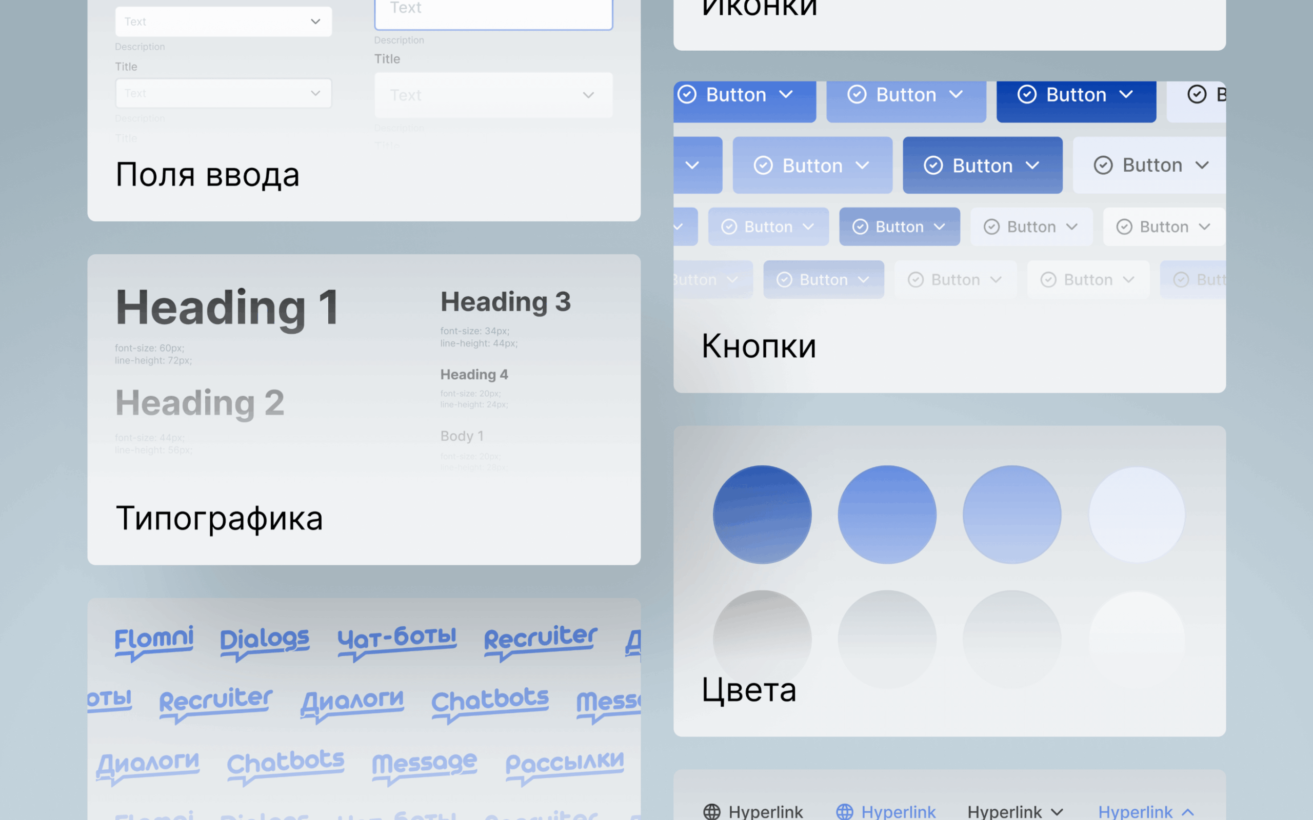
UI-kit for rapid scaling
Set up colors, fonts, buttons, icons, input fields, forms and other repeating elements with all possible states.
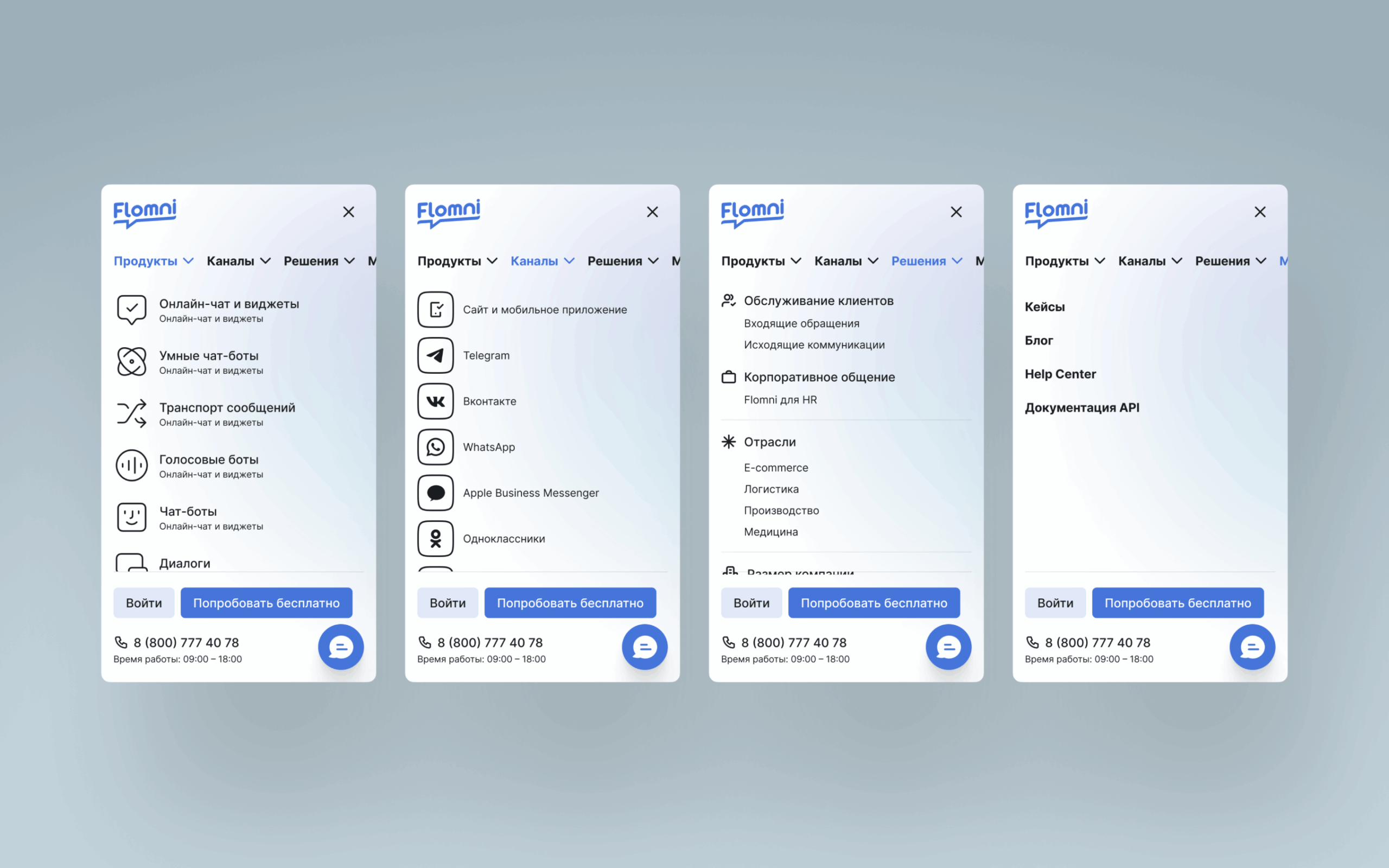
Navigation for different devices
Added subheadings to menu items to increase the likelihood of users entering a page intentionally.
In the mobile version, contact methods are placed at the bottom of the screen so users can tap the button with their thumb and complete the target action.
20 reusable blocks
Created a library of elements that allow quick creation of new pages — product pages, articles and case studies.
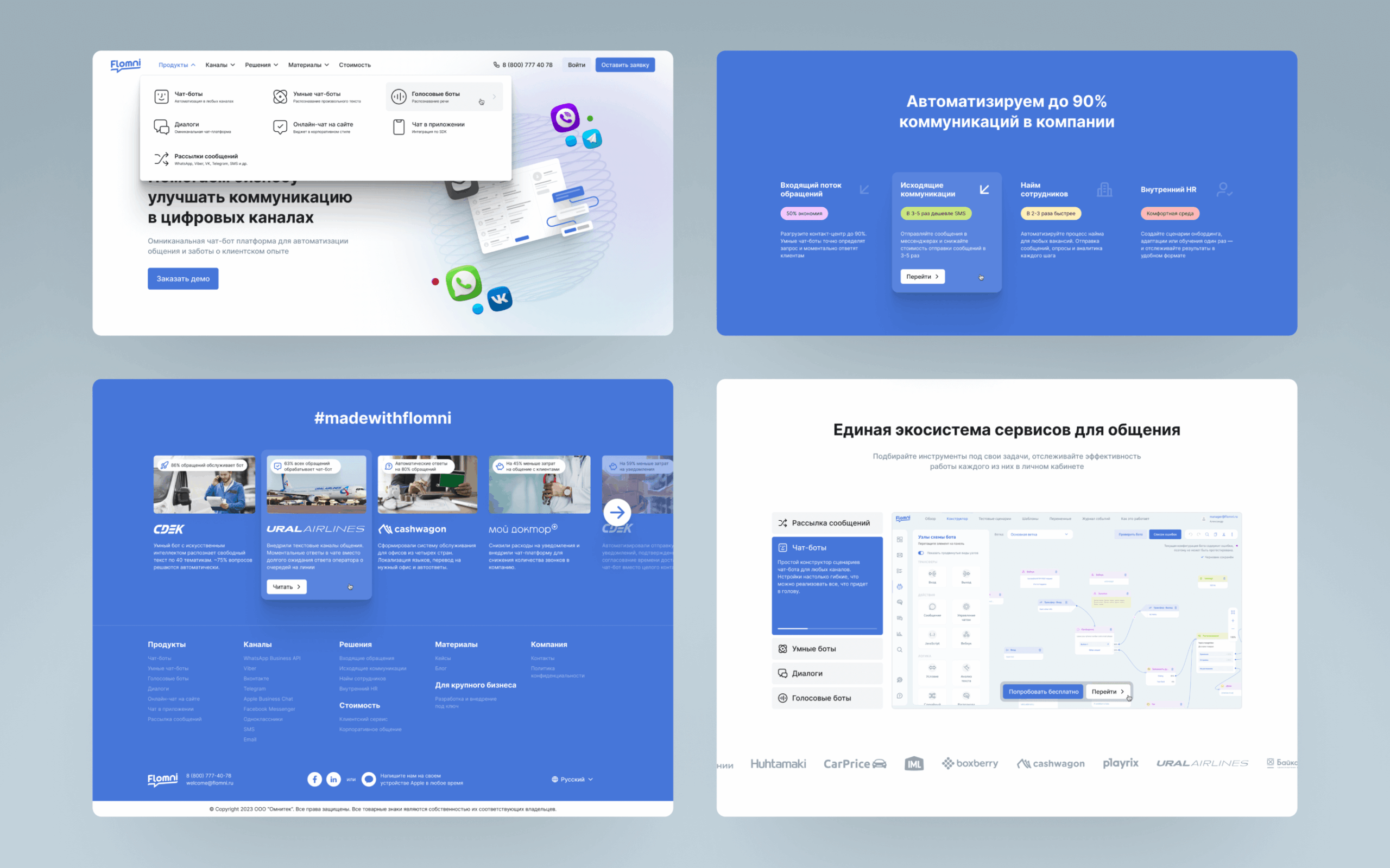
Interactive elements
In the mobile version, positioned them so that key information is visible and CTA is within reach.
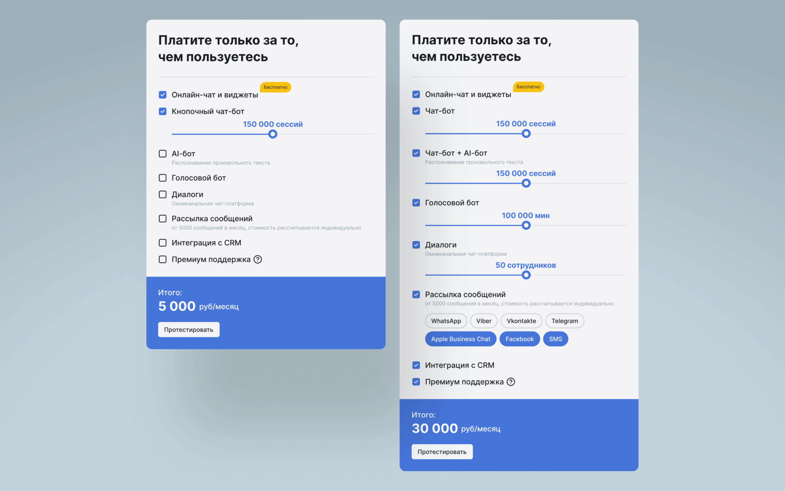
Cost calculator
Displayed the entire pricing structure with flexible calculations so users can find out the cost before contacting the company.
Results
— Created a UI-kit for further website development, rapid design and page layout through Figma API
— Handed off to development layouts and prototypes that clearly demonstrate all interactive elements
— Developed a new corporate identity, documented Guidelines in a separate file with recommendations for using fonts and graphics.