Ru
 Our channel
Raiffeisen
We developed a subscription management system before such scenarios became an industry standard. We designed a new user journey and turned the bank into a control point for everyday expenses.
UX concept for Raiffeisen Bank: a look at subscription management before it became commonplace. Back when Yura Vetrov was brand director at Raiffeisen, and foreign services operated in Russia without restrictions, we at ZHIRNOV Studio decided to explore subscription management services in banking apps and the related user experience.
Unfortunately, our version didn't move forward into further development, and the product continued to evolve through the in-house team. But several years later, we became interested in revisiting these materials – because many ideas that designers across the market were thinking about at the time have since become a familiar part of digital services.
Today this is a small historical snapshot of how we envisioned the banking experience in 2021.
It all started back in 2021
COVID anxiety was gradually fading, but entertainment services – music, movies, subscriptions – remained at their peak and were reaping the benefits of explosive interest from the mass lockdown period.
Buying a Spotify subscription back then took just a couple of clicks, but along with it came unwanted services, hidden terms and phantom charges. Vigilance was a must.
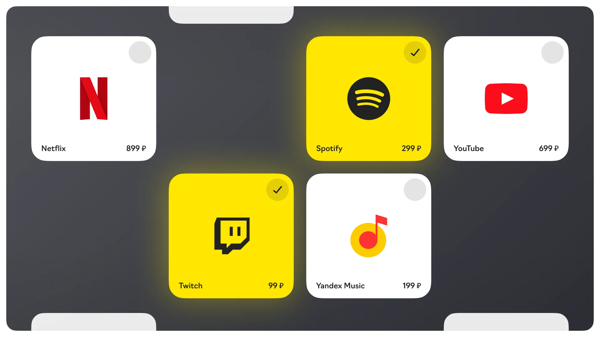
Banks quickly picked up on the demand: users were accumulating so many subscriptions that manual tracking was no longer feasible. And since all payments go through the card, it made sense that the bank could become a management point – tracking transactions and blocking unwanted charges.
This is how subscription management products began appearing in mobile banking apps around the world. At the same time, the Raiffeisen Bank team was exploring opportunities to develop such a scenario for themselves, and we volunteered to develop our own UX concept for this service.
Reconnaissance
We studied competitors. Raiffeisen is an international bank, so we researched best practices not only in Russia but also abroad.
We analyzed Revolut, Wise, and regular mobile services that people open ten times a day. We looked at how banks collect subscription data, studied general trends in banking app changes. And we examined Russian competitors of Raiffeisen from the top 10.
We also analyzed financial self-management services to understand how best to aggregate spending information.
Catching up with web
By that time, Raiffeisen had already updated its web services, and we became curious: how could the same visual language sound in the app? We decided not to stop at just the subscription module, but to go broader – we reconsidered navigation and styling, reworked the UX of key scenarios.
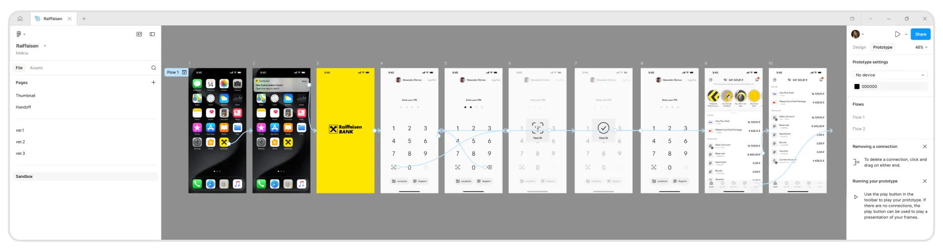
For the presentation, we developed interactive prototypes to clearly demonstrate micro-interactions and gesture controls. Since we planned to test the concept with users through usability research and gather feedback, we immediately built in seamless transitions between screens.
New subscription notification
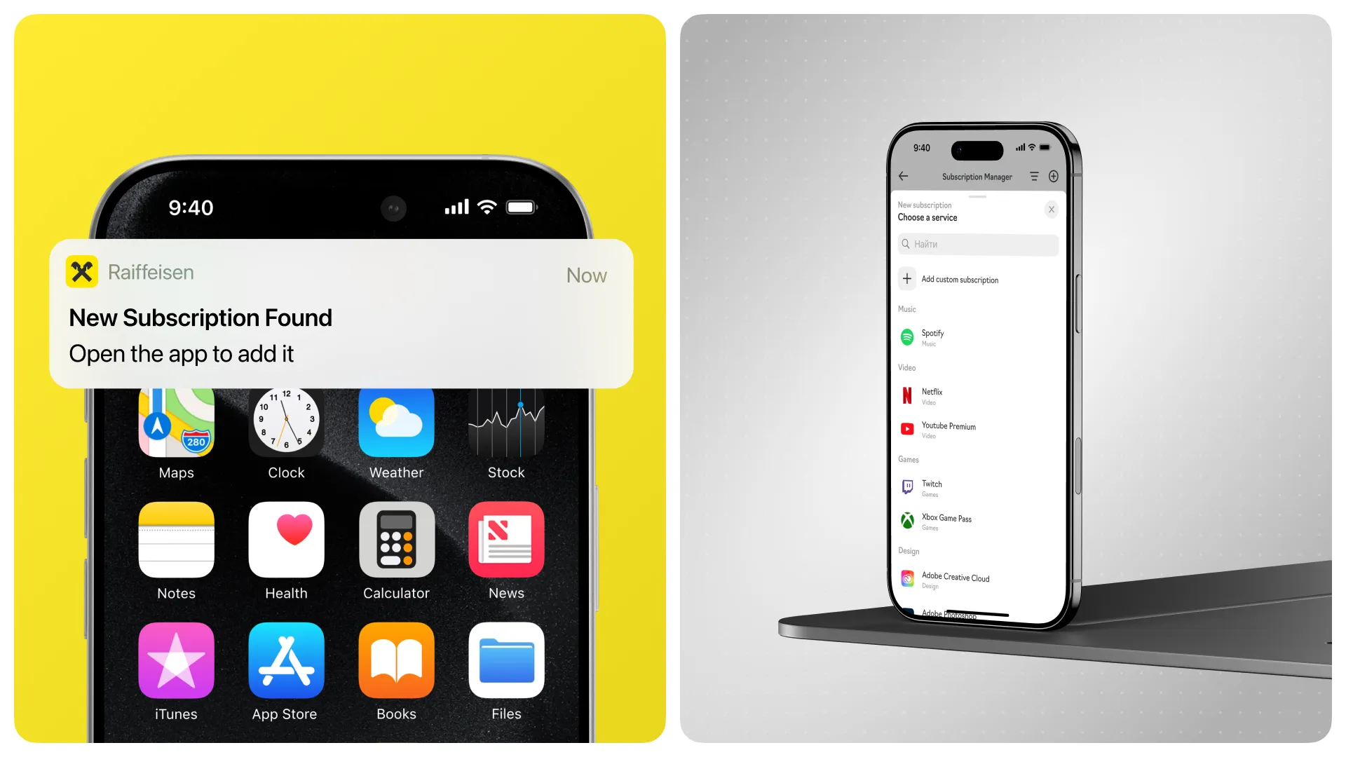
Notifications are a frequent entry point into the app. And banks have an advantage here: users almost never turn off their push notifications. In our case, the scenario starts with a "New subscription found" notification. This is a signal that the bank has noticed a payment to a service among your transactions that wasn't in your accounts before. But we didn't stop at automation. Subscriptions can also be added manually. This way we took a step toward self-accounting – we added personal expense tracking tools to the banking app. Phantom subscriptions no longer accumulate quietly: they're visible and can be tracked in one place.
Stories as a regular contact point
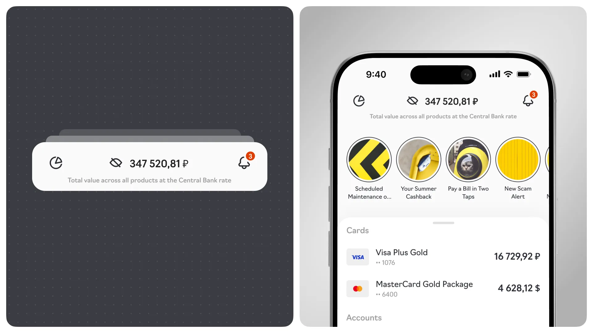
They allow more frequent interaction with the user without being intrusive. We made stories more prominent by moving them to the top – to a zone that has already become familiar to most users across various social networks. And along the way, we achieved stylistic consistency in the interface
The most popular app screen – cards and accounts
We designed it as a universal entry point to all banking service scenarios.
Initially we considered keeping the sticky "+" button from the previous version – a convenient pattern for transitions to payments, opening an account, applying for a loan. However, we decided not to copy, but to build completely new product logic.
Instead, we worked through micro-interactions: panels can now be pulled out and pushed in with scrolls.
Simplifying navigation
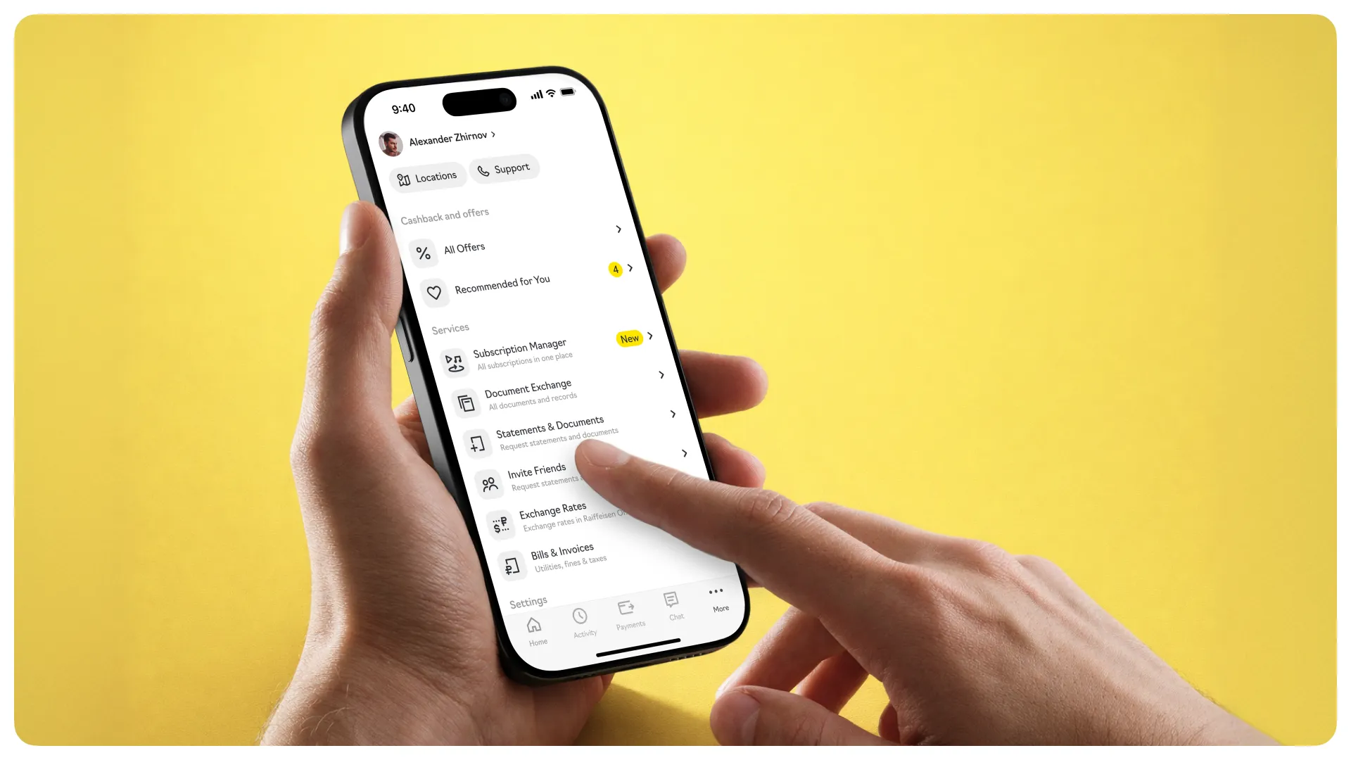
We placed a statistics block in the top left, and a notification center on the right. This allowed us to avoid interface overload and eliminate intrusive red notification indicators in every section – a common problem in banking apps. Overall, the interface was designed to be equally clear to users of different generations – both those accustomed to simple solutions and those expecting a more advanced digital experience.
At the bottom – a tab bar with key sections. Already in 2021, it was a hygiene minimum in app navigation – with it, users can reach any section in 2-3 taps. In the "More" section, we hid cashback, discounts, services and settings.
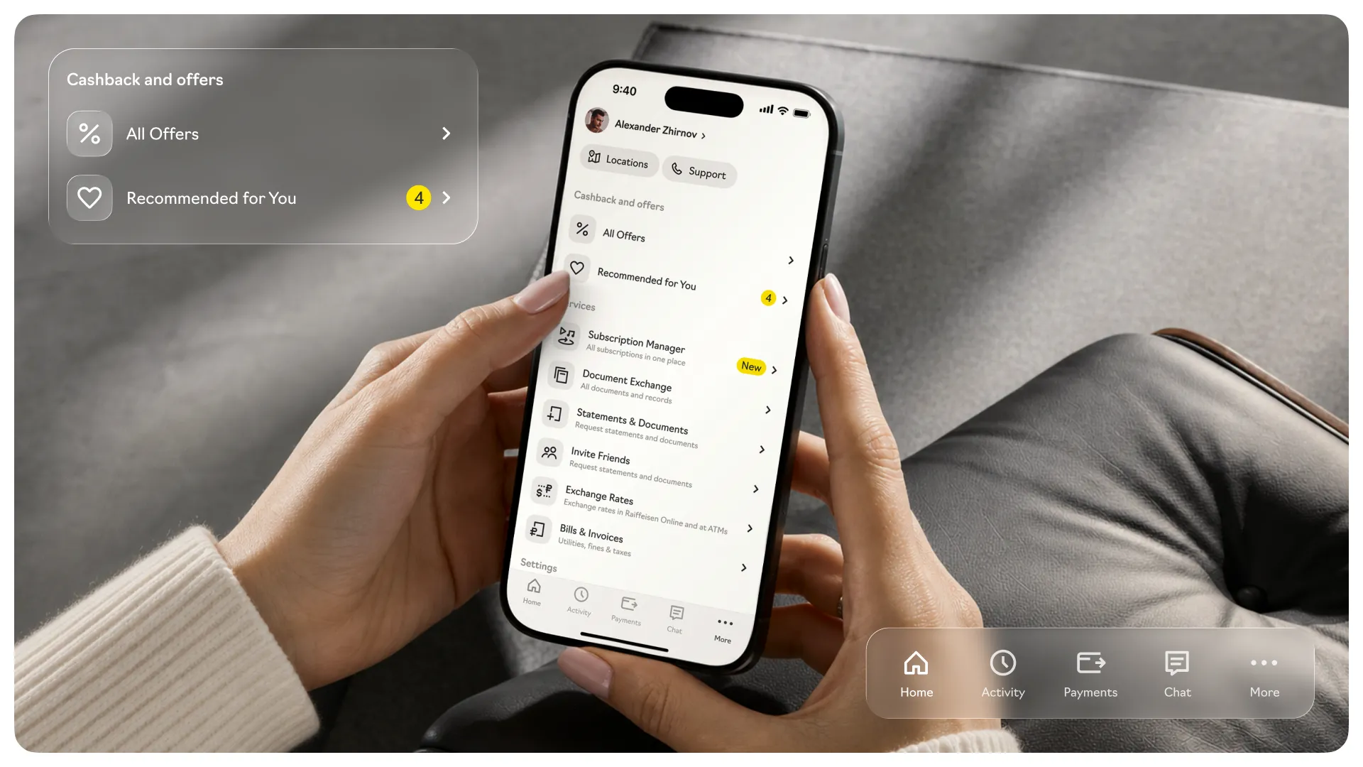
We illustrated all list items with icons so users would spend less time scanning information. The old app lacked this.
Subscription control
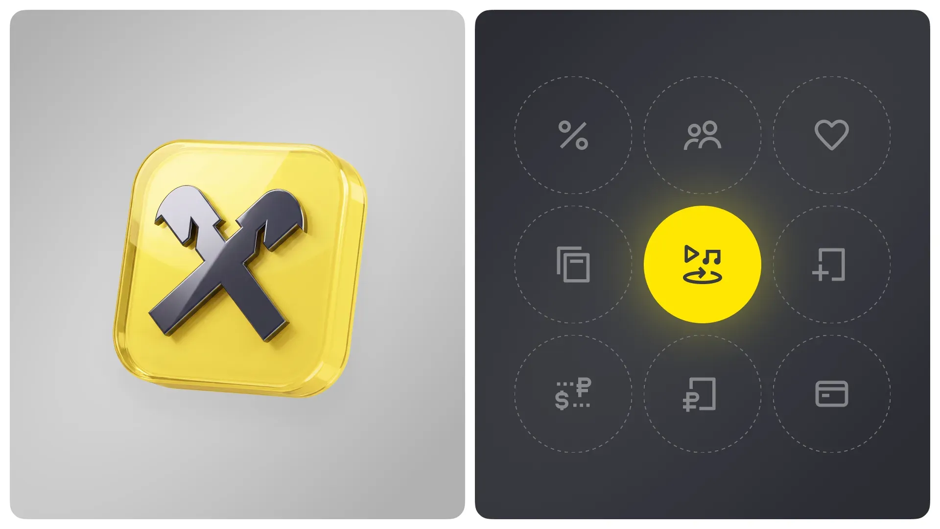
The main feature is subscription control. We created a welcome screen so users would understand where they landed. First, in 2021 people could still interpret "subscription control" differently. Second, learning during use is an important part of UX for new products within large services.
Through graphics, we conveyed what subscriptions we're talking about – the icon references music services and video platforms.
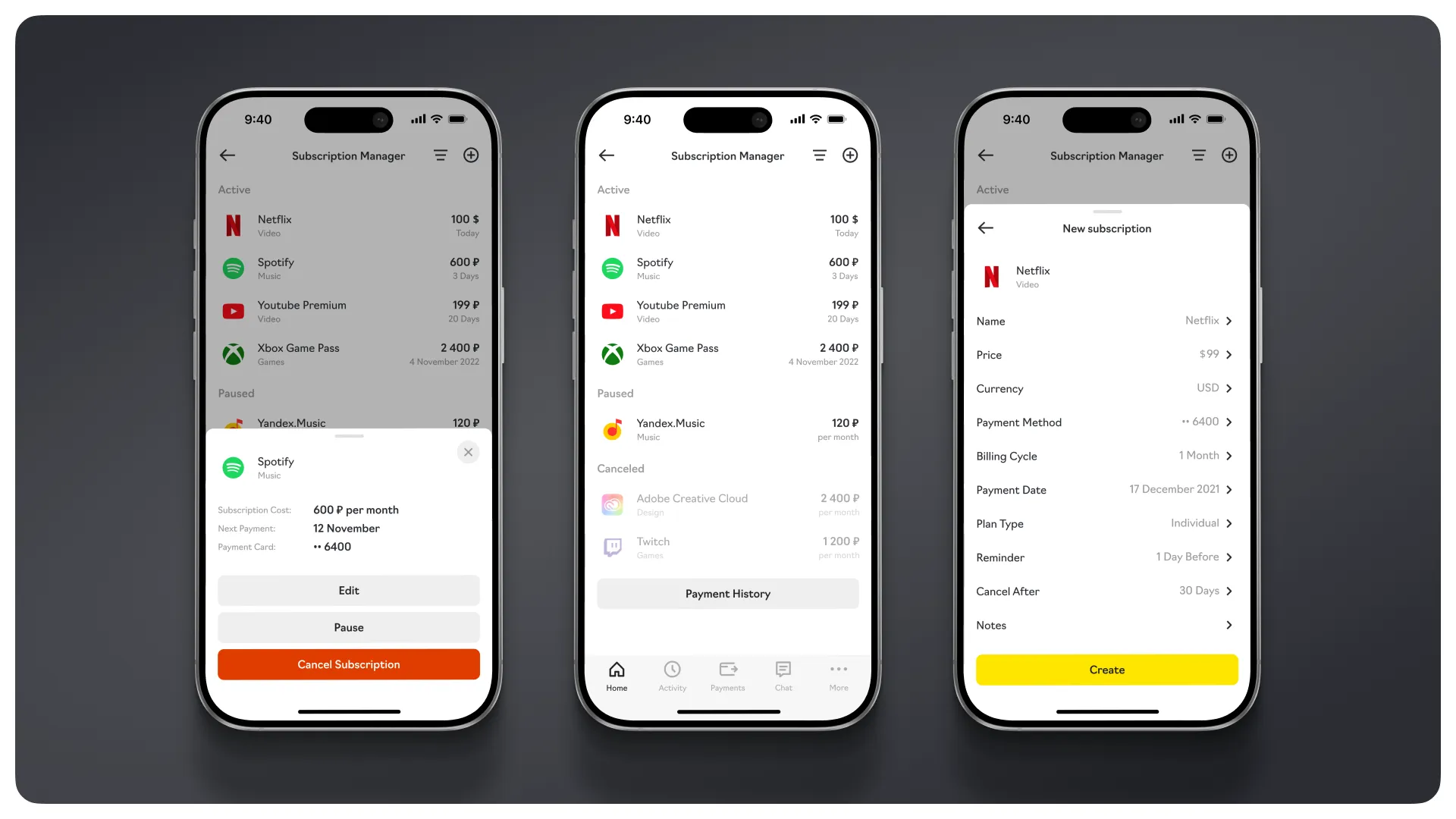
In this section, users can track active subscriptions, find new ones through billing in payment history, or add them manually. Paused and canceled subscriptions are also displayed here.
Transaction history can be conveniently viewed and sorted – for example, by payment date or alphabetically. Detailed statistics are available for each subscription, helping to better understand spending structure.
This case is about changing the bank's role in the user's life. From "a place where money is kept" it gradually transforms into a tool for managing financial habits.
Subscription control is a specific case, but a very telling one. It's about not just showing the balance, but helping a person avoid losing money where they don't even notice the losses. And in this sense, design is not about screens and buttons. It's about embedding into everyday scenarios and carefully bringing order to them.
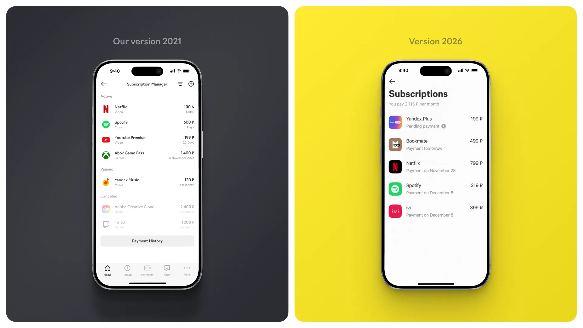
Although the concept never became part of the product, this doesn't make it any less valuable to us. You don't always see the result immediately, but if the design hit a nerve, it will catch up with the market anyway.