Ru
Ru Our channel
Flomni: B2B Platform
We created a platform and conducted a redesign for Flomni. We simplified navigation and structured the product logic so that users could understand the service without account managers. We added a version switching feature to give users a choice.

A redesign that reduced support load and taught clients to use the product. Flomni is a mature platform with a large client base and established processes, not a startup in its early days. So we couldn't just "redo everything." We needed to organize things and arrange them so as not to break old users' habits – while making the product understandable for new clients.
At ZHIRNOV Studio, we know how to turn confusing products into clear interfaces and lower the entry barrier for users. We work with both large companies and startups: Tinkoff, Raiffeisenbank, Rostelecom, etc.
We often start with an MVP and then help the product grow. Today we'll tell you about the Flomni platform and how we helped them update.
Flomni is a B2B platform for business-to-customer communication
It helps companies conduct conversations across multiple channels – on websites, in messengers and social networks – from a single window.
Under the hood, the platform has powerful functionality: omnichannel dialogues, chatbots, broadcasts, CRM logic, analytics, AI assistants and flexible scenarios, SDK, webhooks. And all of this can be customized for a specific company.
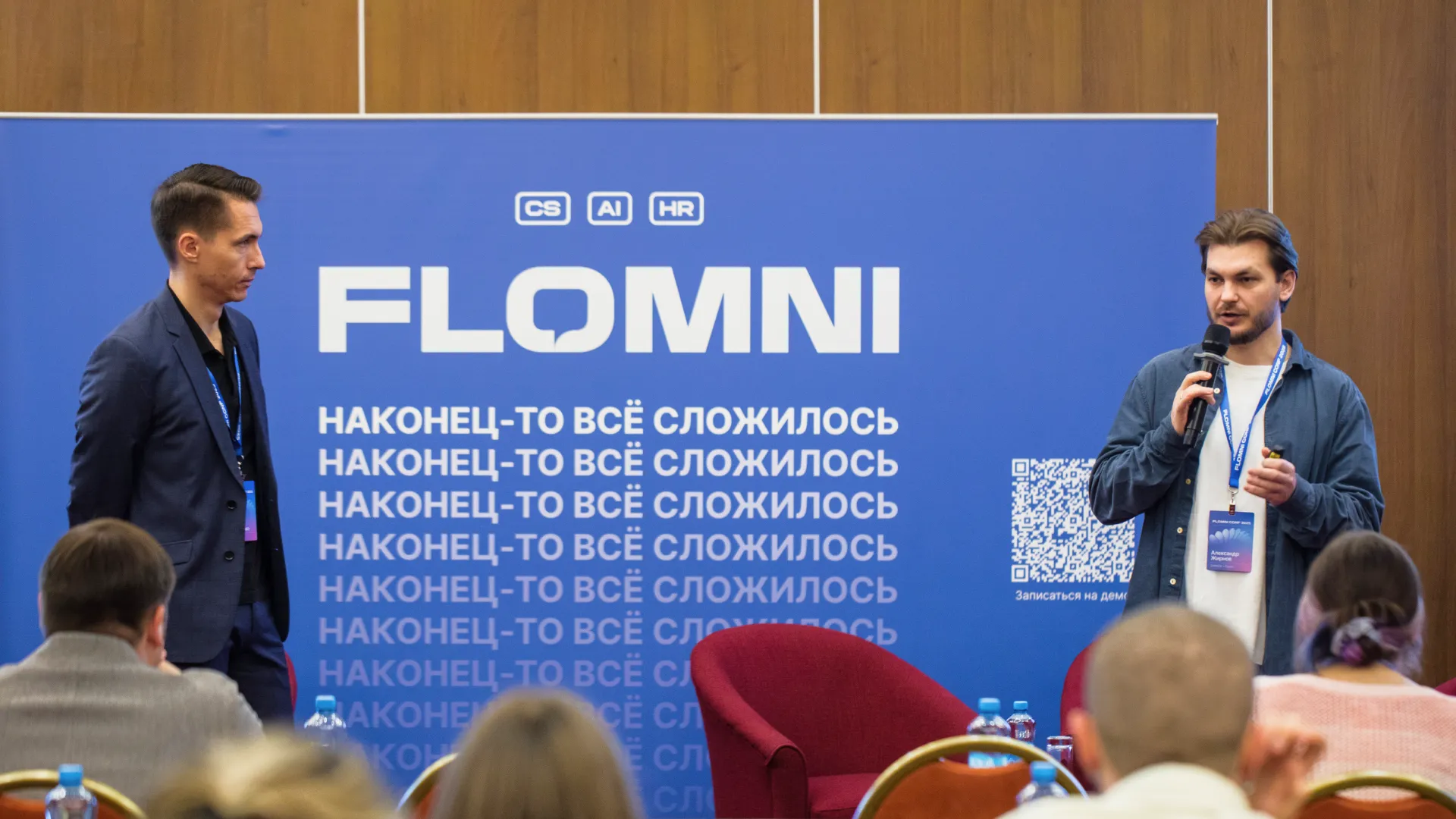
One business needs only dialogues, another needs a complex system of automations and funnels. Flomni allows you to configure all of this.
The platform grew faster than the interface. What to do?
Over time, the platform gained many features, but using them became difficult. Clients rarely logged into their personal accounts and configured almost everything through Flomni account managers.
That's why we were invited to the project. The task was to transform Flomni from a closed system requiring guides into a simple and clear tool. So that clients could easily use it themselves.
Diagnosis: untangling the tangle of functions, names and non-obvious structures
Before changing anything, we broke down the product at the logic and meaning level. We also talked with the product's account managers – people who know client pain points better than anyone.
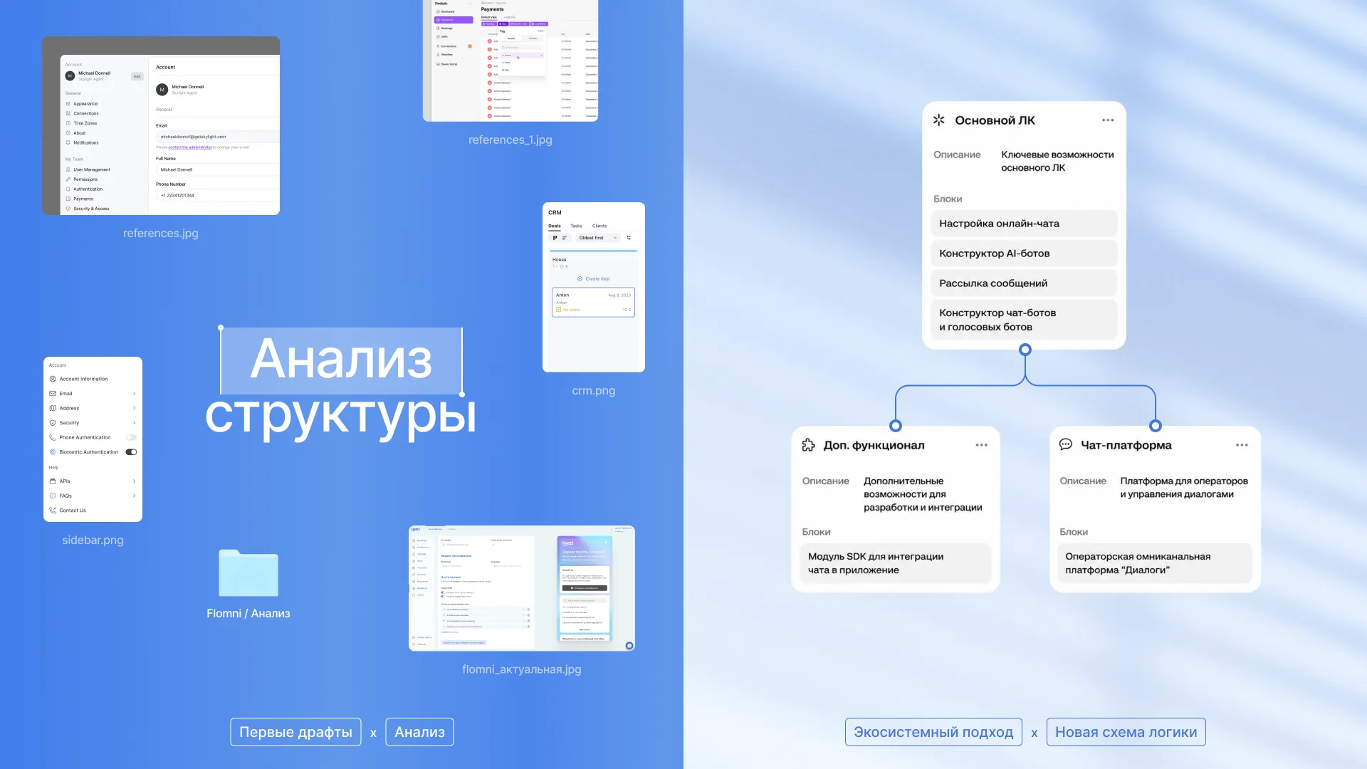
We saw that the interface was overloaded, and almost everything in it was named in the team's internal language. A user would come, for example, to create a broadcast – and find it in the "Tasks" section. They wanted to connect and configure AI, but didn't understand how.
This is how we defined the project tasks:
1. First – organize the logic. We broke down the product at the structural level: what is responsible for what, where functions duplicate, and where identical meanings are scattered across different sections.
2. Second – repackage the product around real user scenarios. We started not from the system architecture, but from how a person comes to solve their task. More on this shortly.
3. And third – implement all changes without pain. More on this below.
Evolution without pain
Flomni has many different clients. Some have been working on the platform for a long time and are used to their flows and names, while others are just logging in and want an immediately understandable product. So making one sharp update for everyone was impossible.
We solved this through functionality management. Individual features can be turned on and off for specific clients – this is handled by account managers, not users themselves, so no one accidentally breaks anything.
As a result, the platform began living in two versions simultaneously, and different clients have old and new sections in parallel: "Message Transport" and "Broadcasts," "Dialogues 2.0" and "Dialogues 3.0," "Megamind" and AI. We'll tell you more about this later.
We're transitioning some to the new version through flow rebuilding and training, leaving others in their familiar logic. And for those who haven't logged into the product in a while, the updated interface often becomes a reason to return and look at Flomni with fresh eyes.
A similar practice, by the way, was used by LinguaLeo. When they removed "Jungles," some users took it hard, and upon request to technical support, they temporarily turned the old interface back on for them.
Now let's move forward, I'll tell you about how we reconceived navigation and sections.
The same logic – providing flexibility without breaking habits – formed the basis of our work with the menu
The menu in Flomni could be expanded and collapsed before. We kept this mechanism but made it more convenient for daily work.
Now the menu can be fixed in the desired state. If it's important for a user to see the full list of functions, they fix the menu in open view. If they need more workspace – they collapse it.
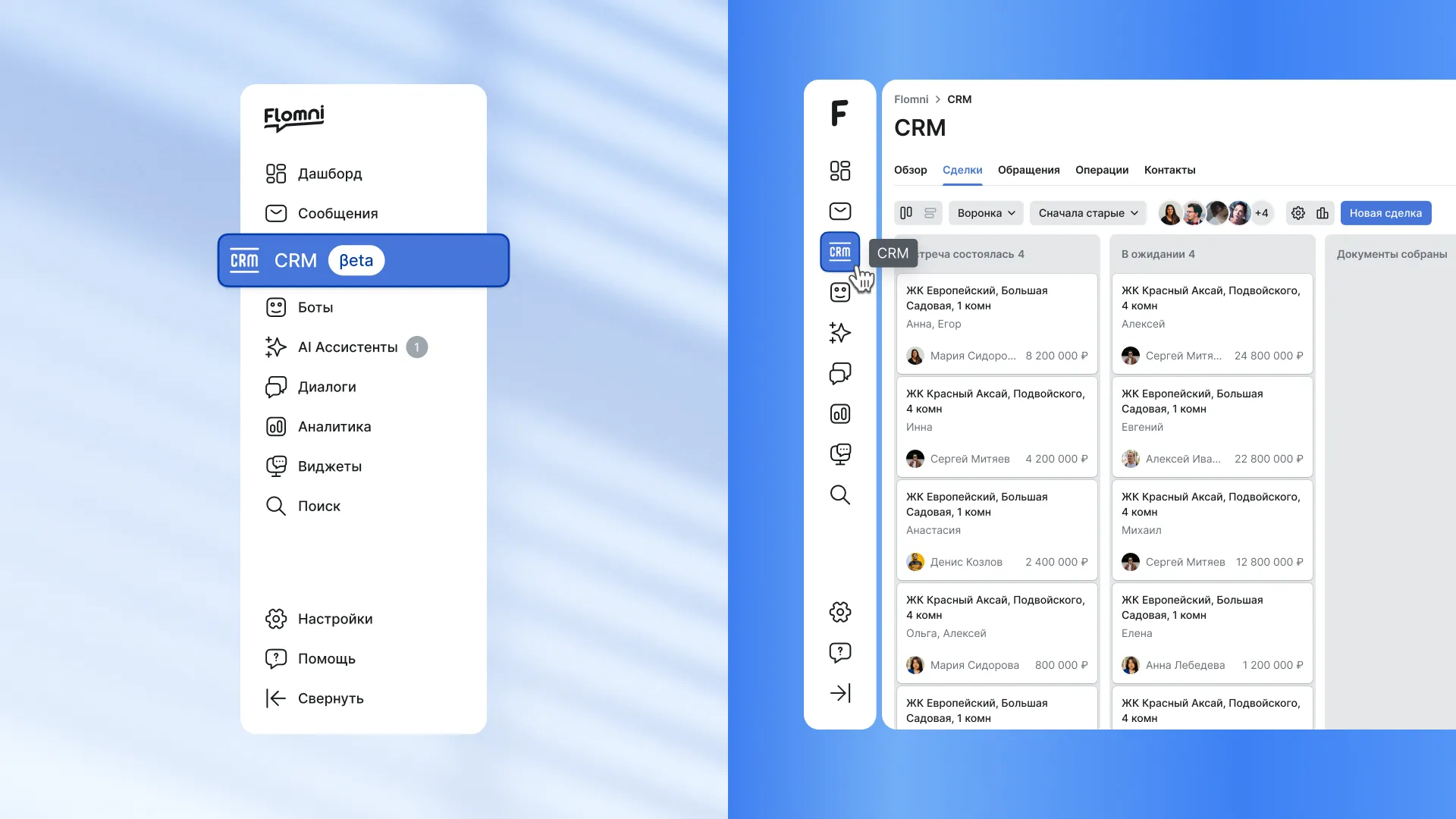
In the open state, menu items are displayed with icons and names, making navigation easier. In the closed state, it remains compact, doesn't stretch across the entire screen, and doesn't distract from work.
Dashboard: quick snapshot of dialogue status
The dashboard remains the first screen where work begins. We simplified and refreshed it visually: made it lighter, more compact and calmer, so key metrics are read immediately. Here you can see how conversations are going, how much time is spent on responses and what's happening with goals.
We also cleaned up the colors. In the old version, negative indicators were highlighted in blue and purple, which was confusing. We aligned the colors with familiar patterns: red – when there's a problem, green – when everything is fine.
Chatbots: from "branches and releases" to scenarios and versions
The chatbot builder is one of the strongest parts of Flomni. But previously this functionality was difficult to use due to language and structure.
A user who wanted to create a bot to answer questions encountered an interface where they had to work with "branches," make "releases" and track "threads." This was a tool for developers, not for marketers or managers.
So we renamed everything confusing. Instead of an abstract "branch" there's now a specific conversation "scenario." "Order placement scenario," "Newsletter subscription scenario." That's how business talks, and that's how the interface talks now.
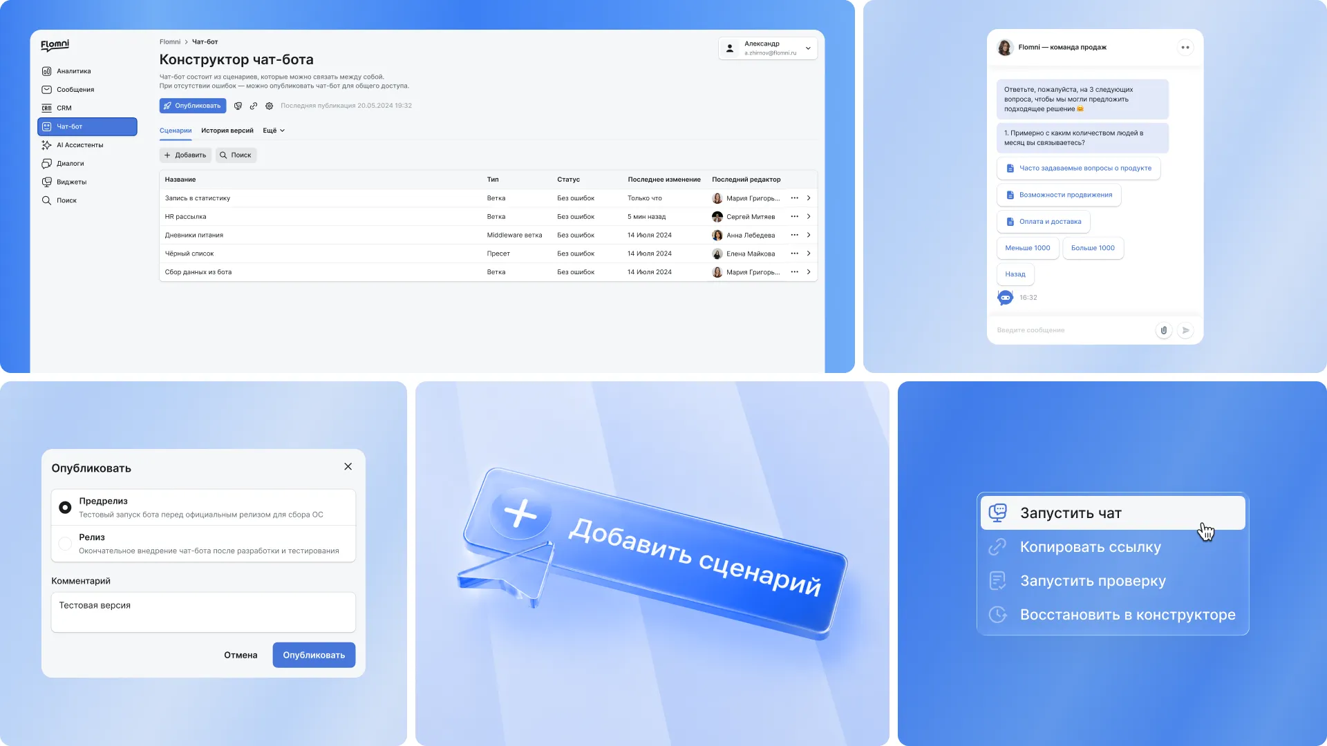
Same with releases. Instead of a technical term, version history appeared. In the section you can see where the draft is, where the test version is and what's already published. You can see what changed, and you can always roll back.
We simplified the builder itself. Instead of a complex scheme, a visual editor with blocks appeared – dialogue steps. They can be dragged, configured and tested in a separate window – or launched immediately if the bot is ready.
All scenarios are collected in one list, and the bot can be launched directly from there. The user clicks "Publish," selects the mode – test or production – and if there are errors in the settings, the system immediately suggests what needs to be fixed before rolling out the scenario.
In the old version there were two top tab bars, and because of this it was easy to get lost: tabs within tabs, unclear where you are now and where to click next. We laid them out in one line and removed the second nesting level.
How several entities were born from the "Tasks" section
Conceptually, "tasks" allowed configuring automated actions: connecting chatbots, mailings and CRM logic together.
For example:
1. A client clicked a button in a chatbot – a deal or event is created in the system
2. An event occurs in CRM – a message is automatically sent to the client.
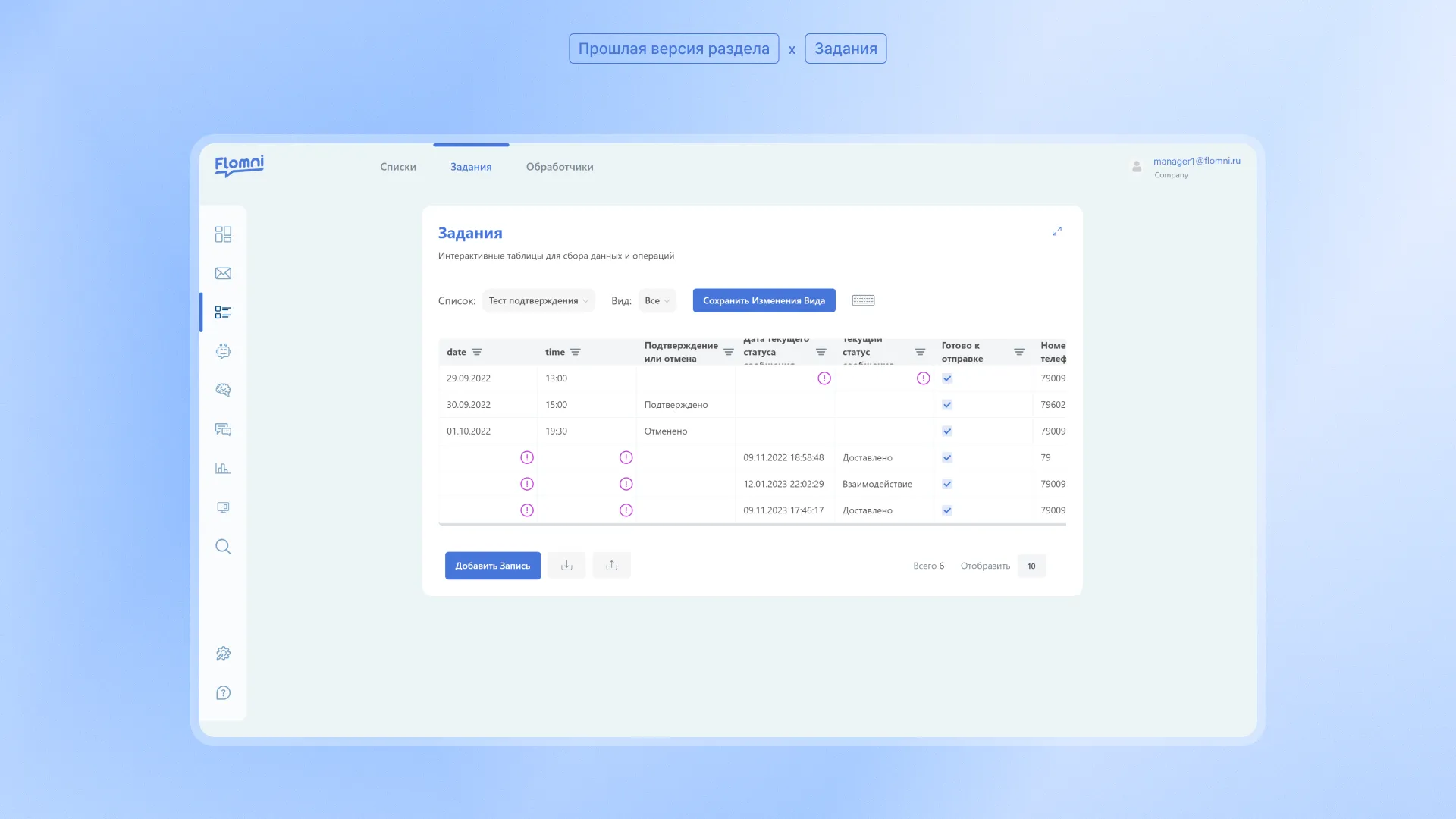
Importantly, users didn't come to "do tasks" – they came to manage clients, send mailings, configure automation. So we split one big combine into understandable entities.
CRM: a separate product within the platform
Based on the "Tasks" logic, we extracted a full-fledged CRM. We took the table model as a basis and reconceived it as an independent product.
CRM starts with a landing page and three basic lists:
1. Deals
2. Requests
3. Contacts
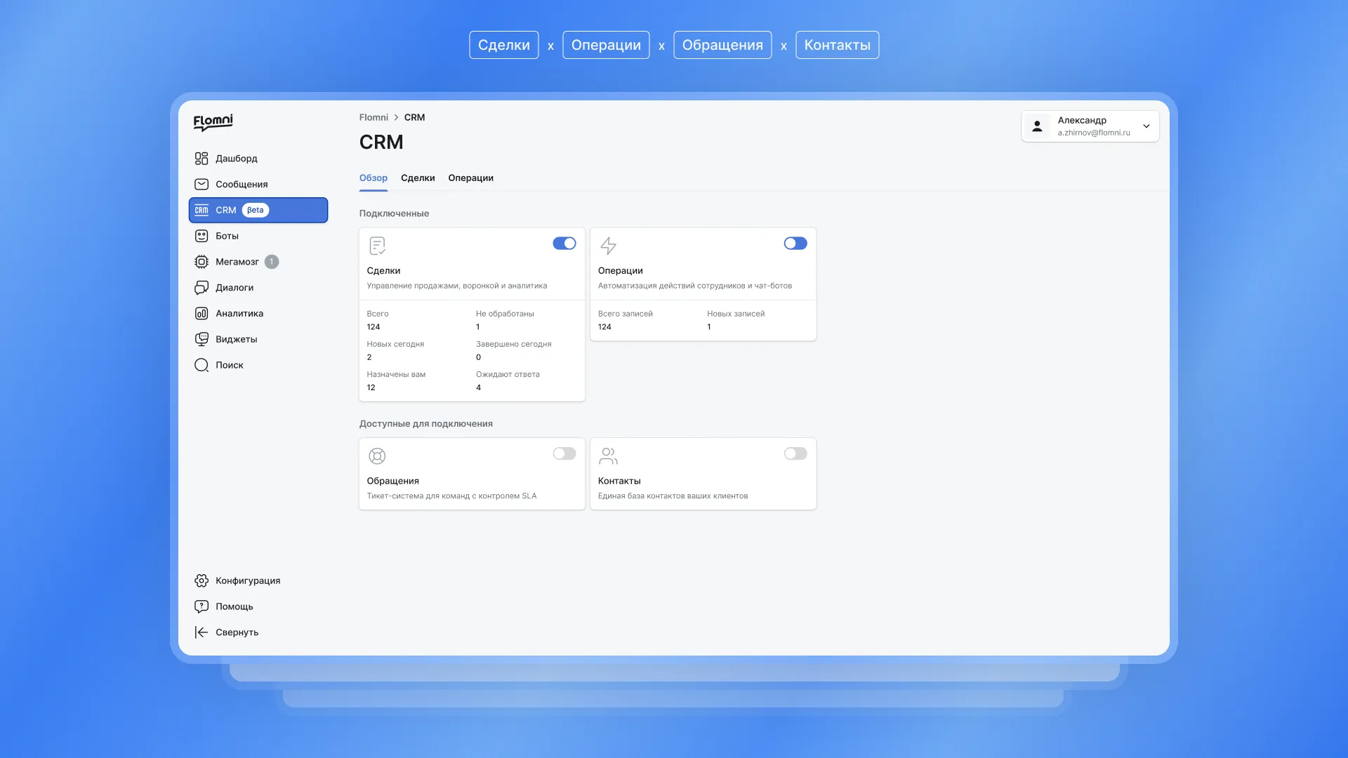
Separately below – a universal block for all other scenarios, where you can build your own structure for a specific task.
Inside CRM you can now:
1. Work in a table or in kanban;
2. Move deals through statuses;
3. Assign responsible persons;
4. Filter, sort, create records;
5. Customize cards for yourself – add any fields (deadlines, contractors, comments, etc.)
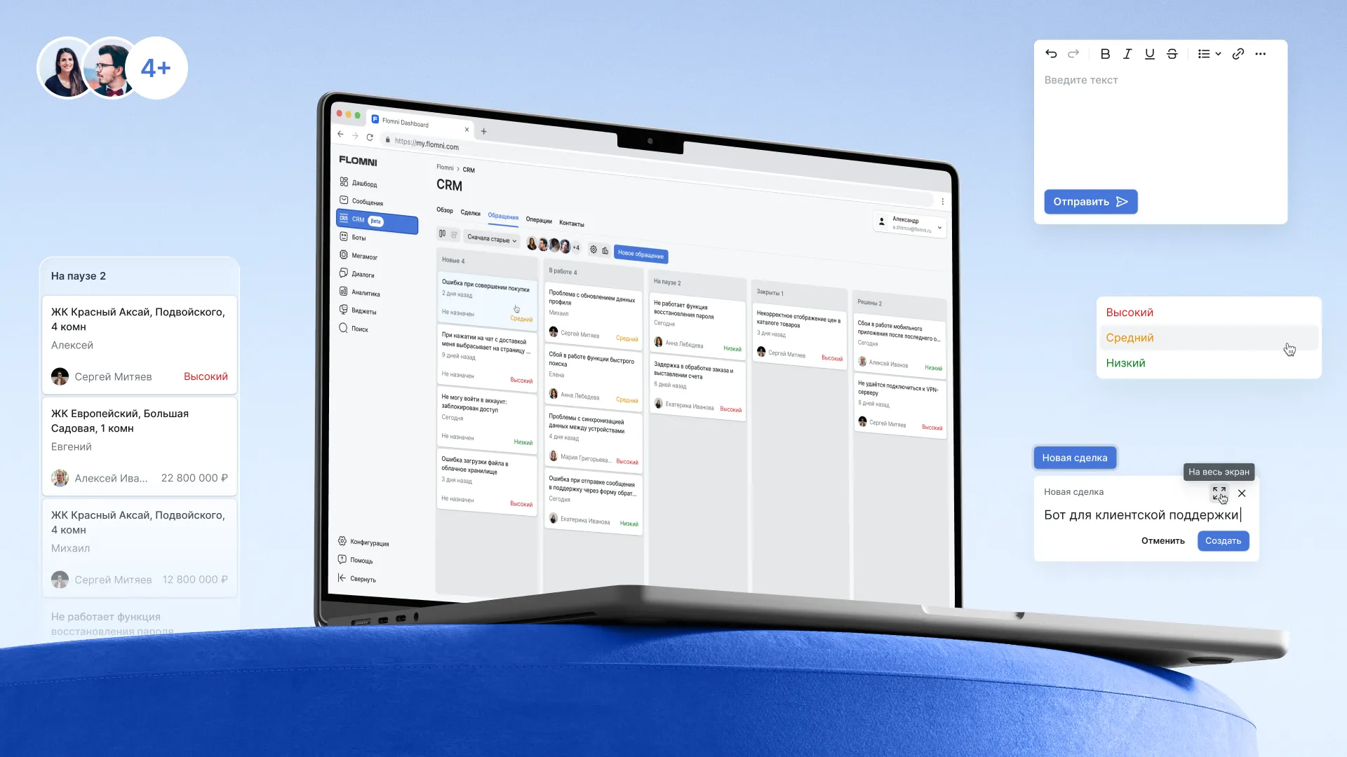
And yes, important point: the Flomni team itself switched to this CRM inside their own product. When a company uses its own product – that's really cool. And it's the best indicator that it became functional.
Most of what was previously called "Tasks" was actually about mailings
This became clear from conversations with the product's account managers. So we simply called things by their names and moved everything to a separate section – "Mailings."
Here are the section's components:
– Templates – where message texts are created;
– Cascades – step-by-step sending logic (for example: wrote in WhatsApp, no response – after a few days sent to another channel);
– Blacklist – contacts to whom we don't send messages, to avoid wasting budget;
– Mailing lists – essentially, a contact database.
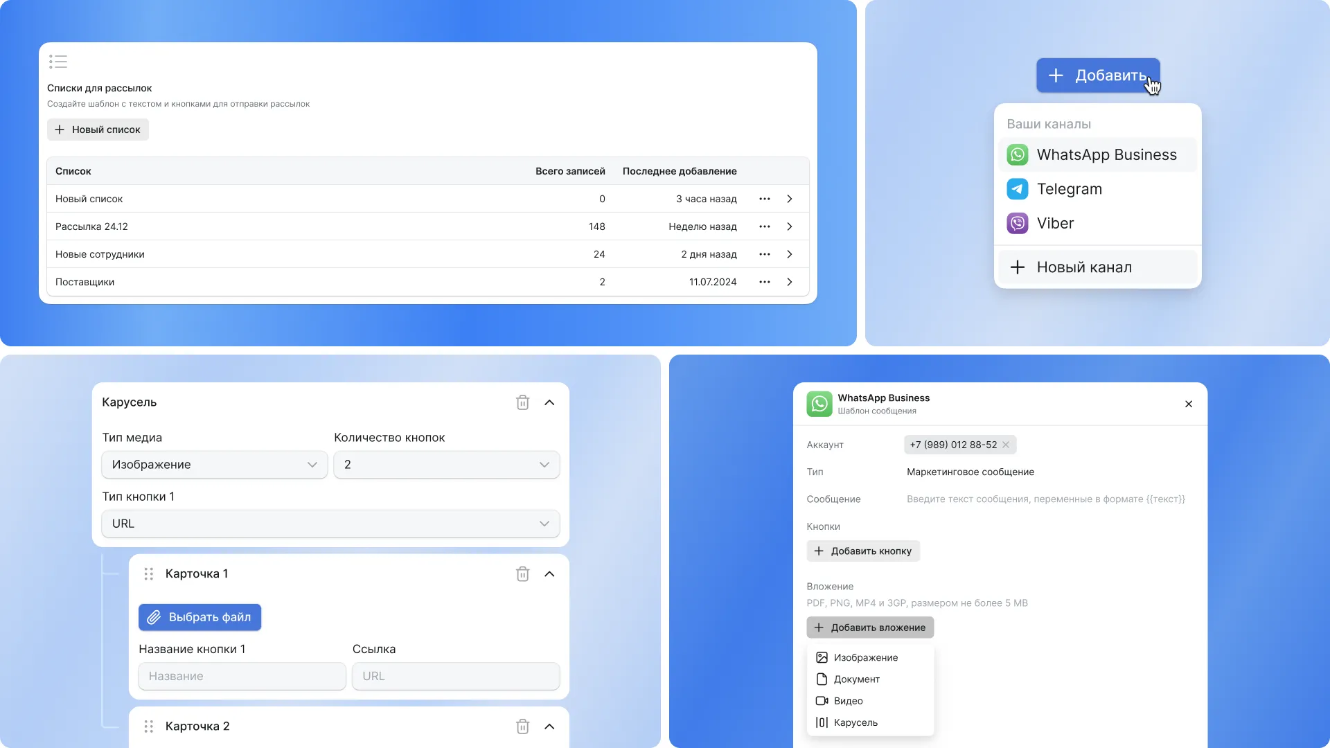
Communication channels are configured in the personal account in advance, but if the needed channel isn't there, it can be added directly from the cascade editor.
In their logic, mailings are similar to CRM, but focused specifically on communications, not on client management.
Messages and legacy
Historically, Flomni had a "Messages" section. It remained for old clients and essentially combined the logic of the former "Tasks" and mailings. We brought it to the common visual style but didn't remove it abruptly to avoid breaking what was familiar.
In the new version of the product, "Tasks" and "Messages" as separate entities are no longer used – their logic is distributed across the CRM and Mailings sections.
Turning "Megabrain" into an AI prompter and merging the personal account with another service
AI in Flomni appeared even before the hype around LLM and ChatGPT. Back then it was called "Megabrain" and helped operators respond to clients faster in chats using intelligent suggestions. The quick replies themselves were only available in the "Dialogs" service. There, the operator would communicate with the client, press the "apply quick reply" button and get a suggestion for a response.
But then the problem began. For these quick replies to work properly, the AI needed to be configured and retrained: add examples, manage logic, work with models. And all of this was located elsewhere – in the Flomni personal account, in a separate section called "Megabrain".
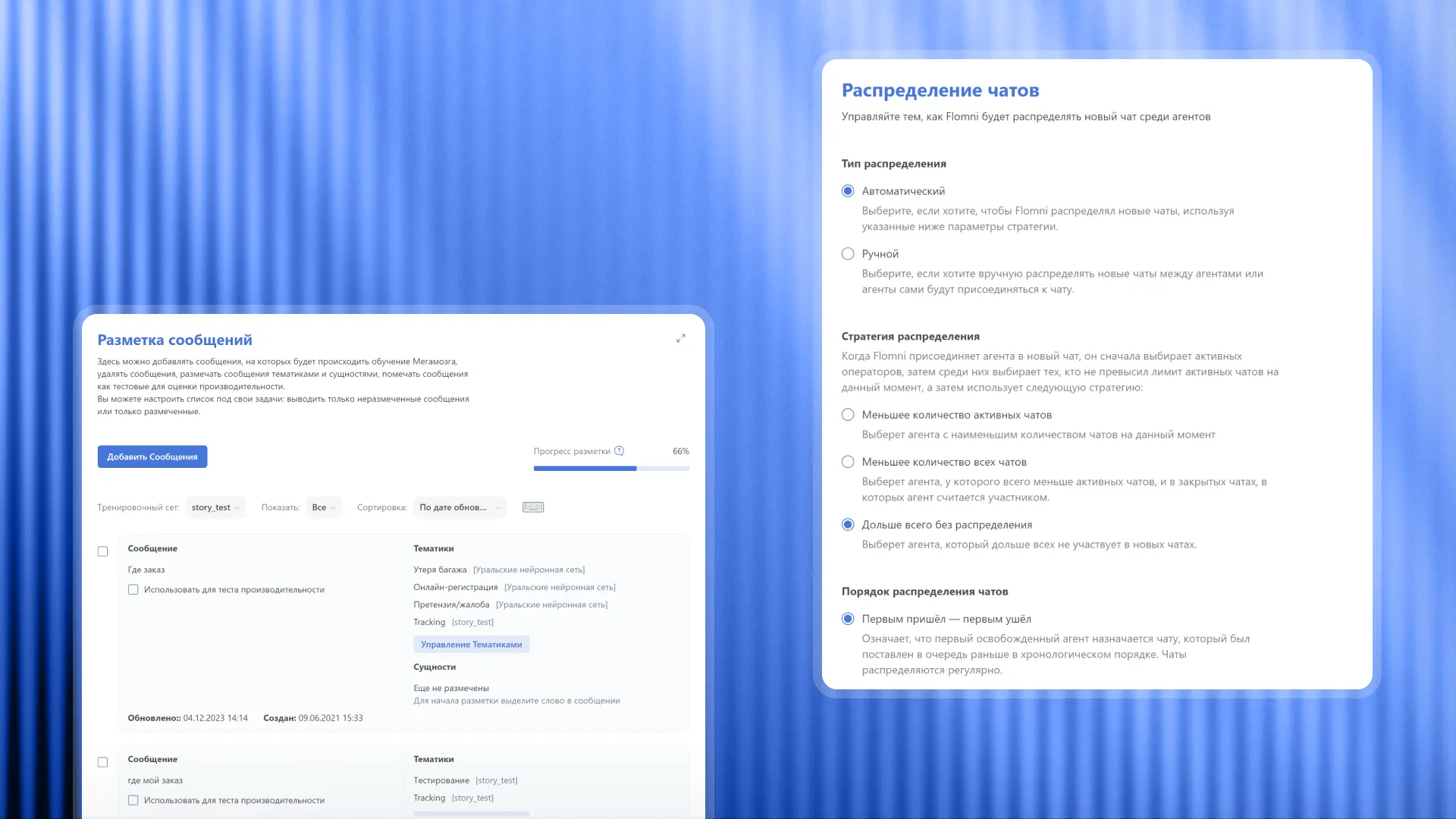
The result was a broken chain:
– You use AI in one service – in dialogs,
– But configure it in another – in the personal account.
... while there's no direct and obvious connection between them.
The user had to figure out on their own that "quick replies" in dialogs and "Megabrain" in the personal account were the same thing. Where exactly to change AI behavior, how it would affect responses in chat, and why go there at all was unclear. Because of this, the AI functionality was underutilized.
So we formulated a principle – AI configuration and use should be connected and located as close to each other as possible.
First, we embedded dialogs directly into the personal account and brought everything together into one platform. Then we abandoned the abstract "Megabrain": instead, an AI assistant appeared for configuration and training, and in the operator's chat – an AI prompter.
By the way
Inside the AI section there is:
– Ready-made templates and situational scripts (for example, for hiring);
– The ability to take them as is or retrain them for your scenarios;
– Knowledge base – essentially, instructions "how to assemble and use all this" in the product;
– The ability to configure integration with external AI services.
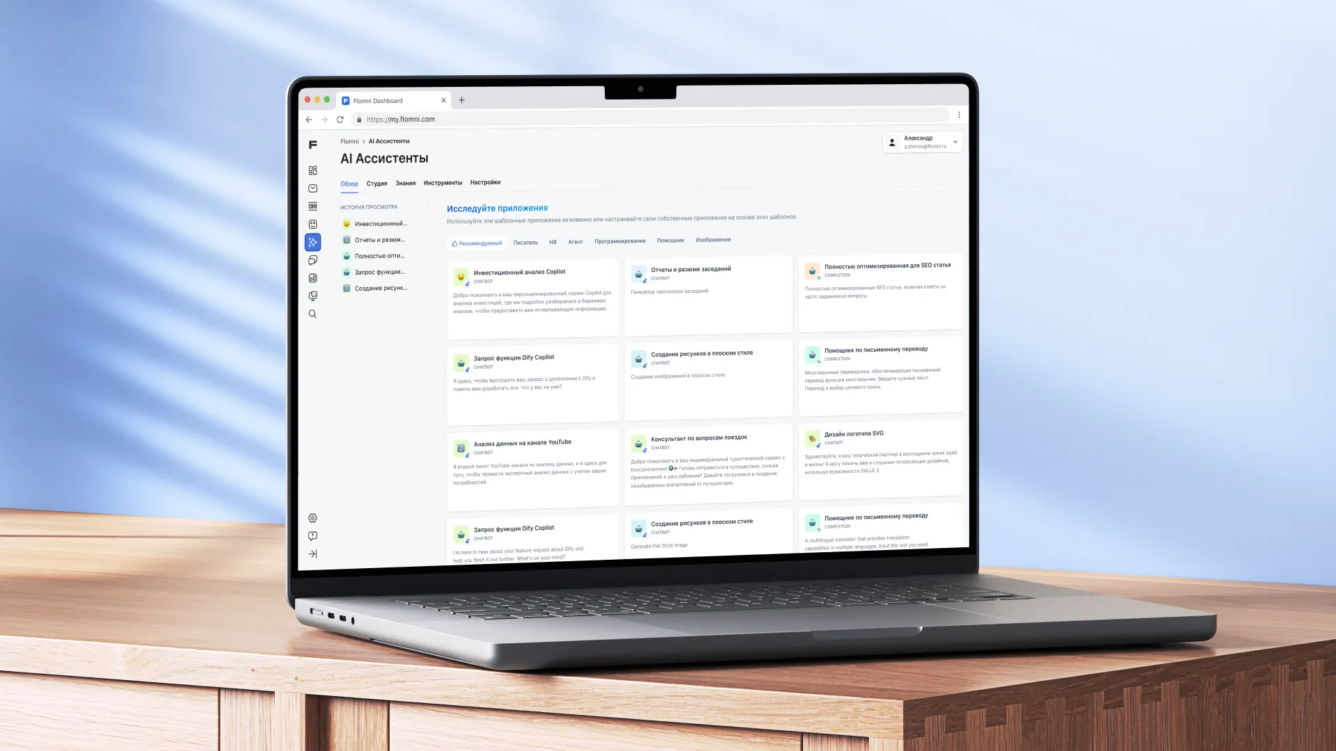
Separately, inside the AI assistant there's a dashboard with statistics – you can see how often the AI prompter is used, where it actually helps and where it doesn't.
By the way, Flomni AI knows everything (or almost everything) about the client
From CRM you can open a client's profile and see the entire history of their requests: chats, statuses, actions and events related to them.
In this same card, an AI summary is available: a short resume of all correspondence and previous requests. AI gathers the main points – what was discussed, what the client wanted and at what stage the dialog is now. This helps quickly get into context, even if different employees communicated with the client or the correspondence has been going on for a long time.
The analytics dashboard is also built on AI
And the principle in the section is this: first you configure what exactly you want to see, and only then create a report.
Filters can be customized (for example, a report on operator workload), saved – and then used as a separate report. Favorite reports are pinned, each has an explanation of what exactly it shows. They can even be commented on – for your own convenience or for employees.

Build a widget in 30 seconds
Custom widgets for the website are now built directly from the personal account. Essentially, it's a small design constructor with icons, buttons, colors, styles.
Everything can be configured in a couple of clicks – without designers and... Flomni account managers.
Making the platform customizable
In platform settings you can connect communication channels, work with metadata and CRM fields; configure chat tags, and if the needed functionality isn't available "out of the box" – use webhooks.
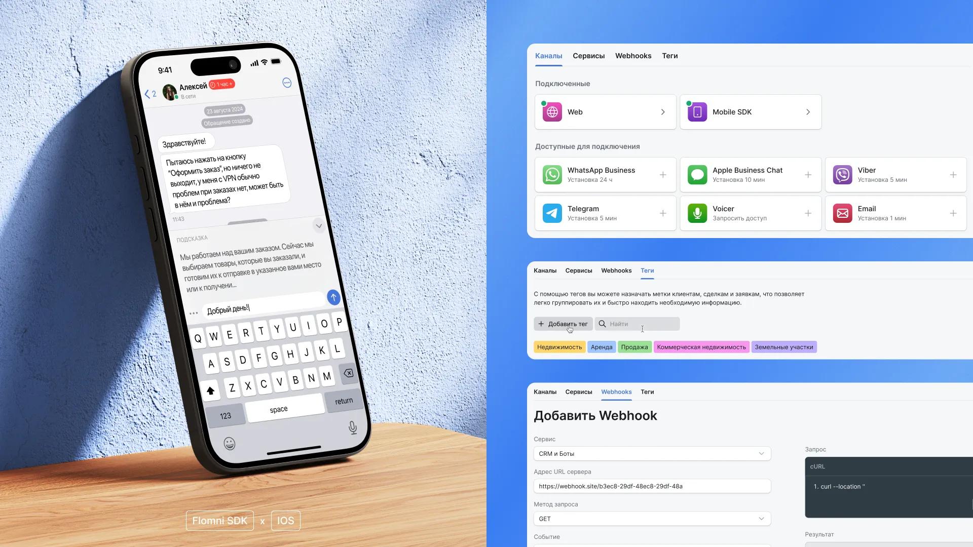
If you want more...
Flomni integrates with external services and CRM through API. And for mobile applications there's an SDK to embed everything directly into your app.
Flomni HR: a separate product for recruiting
This section deserves to be made into a separate material, but for now I'll tell you about it. The product grew out of an experiment – at some point it became clear that this was no longer a feature inside the product, but a separate platform with its own logic.
At the center of the product are vacancies, candidates and scoring. You create a vacancy (including with AI autofill), set requirements and questions, and then the system itself collects data and forms a candidate profile.
There are two work scenarios:
1. Through applications (incoming candidate flow),
2. Through active search (you find and evaluate yourself).
Instead of dozens of resumes – an immediately clear summary: who fits, by what percentage and why. Plus a single screen where you see everything: candidates, stages, scores and statuses.
Product autonomy thanks to the design system
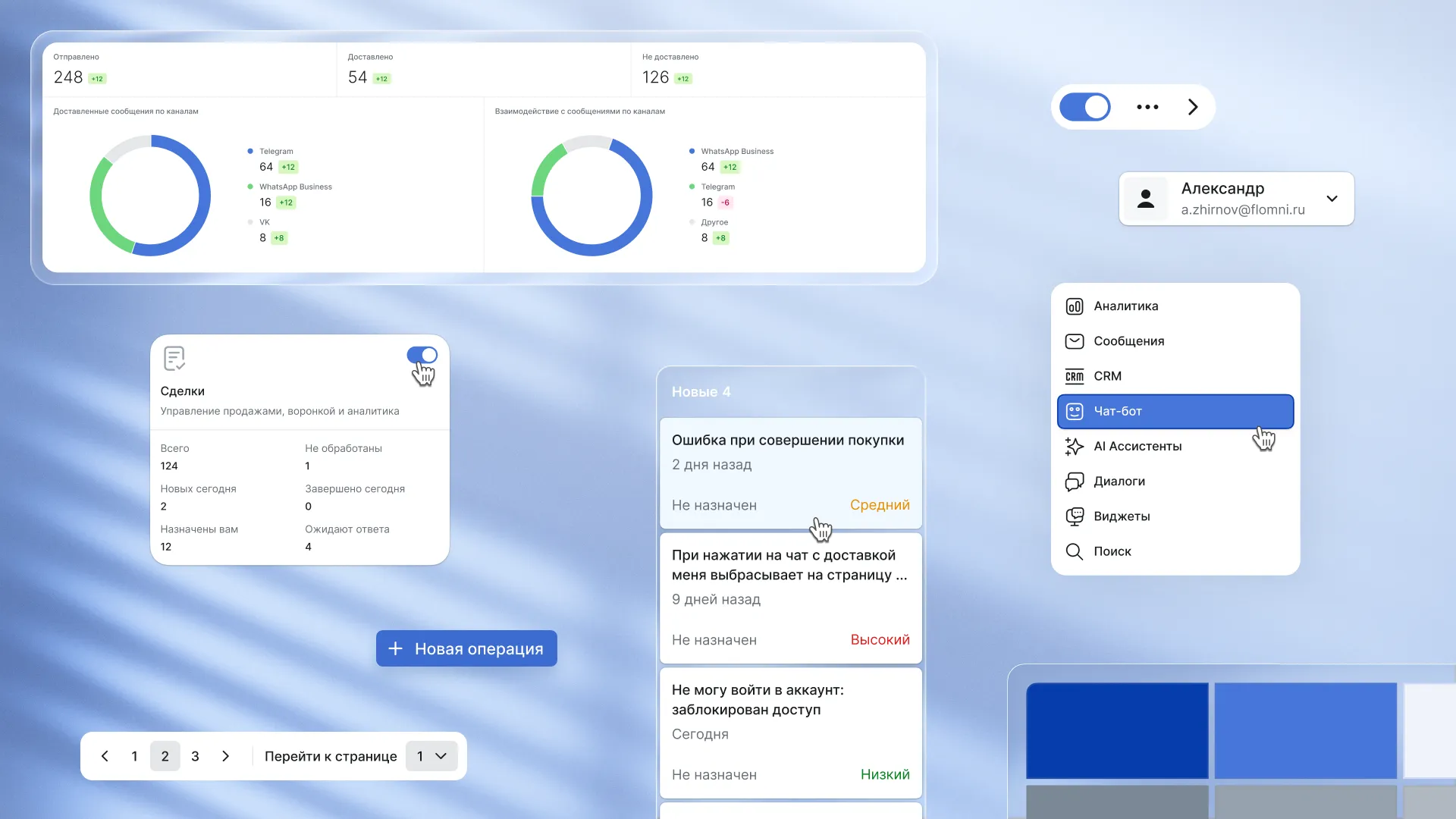
We eliminated the human factor on the frontend: the team can't accidentally break the layout or violate the styles. Adding new features and products won't require our participation – the client's team will do it themselves without errors, and the product will continue to evolve with the in-house team – based on what we laid down in the design system.
What's in the plans?
The product is already live and evolving, but we still have a lot to do. For example, global search across the entire personal account, so that the needed function or setting can be found from a single field.
We also laid the foundation for multi-accounts. Soon there will be an option to conveniently work with multiple accounts in one session – switching between them without constant logging in and out.
Results
We didn't make a revolution, but an evolution without bloodshed. We also returned control over working with the platform to the user – and, we hope, peace of mind.
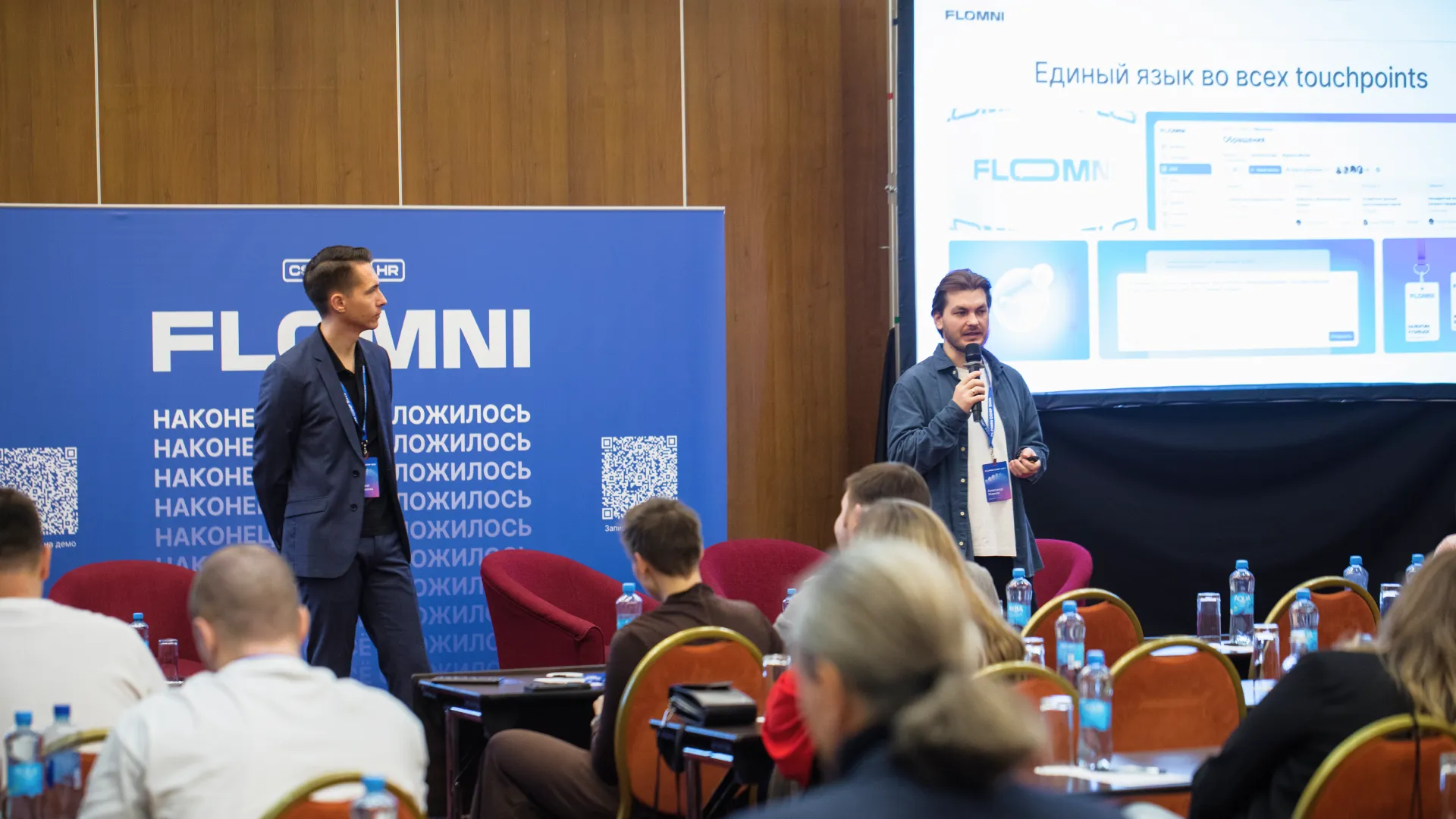
Here's what the client himself thinks about the updates:
We've been working with ZHIRNOV design studio for over three years. Alexander came to us by recommendation – and it immediately became clear that this is not just a designer, but a specialist with product thinking and a self-service philosophy: "making the complex simple".
During this time, we completely redesigned the websites, personal account, created our own design system, established a process for working with mockups and set up synchronization between design and development.
At the very beginning, Alexander said: "If we start working together – you'll forget about design as a problem". That's how it turned out. Today the studio is not only Sasha, but also designers who share his philosophy. Current tasks are handled by agency employees, and Alexander gets personally involved in key matters, performing the role of Art Director. We trust him as one of the key people in the company. I recommend ZHIRNOV design studio to those who want not just beautiful design, but a partner who thinks about the product.
Alexey Sivoshenko, founder of Flomni service