Ru
 Our channel
Flomni: branding
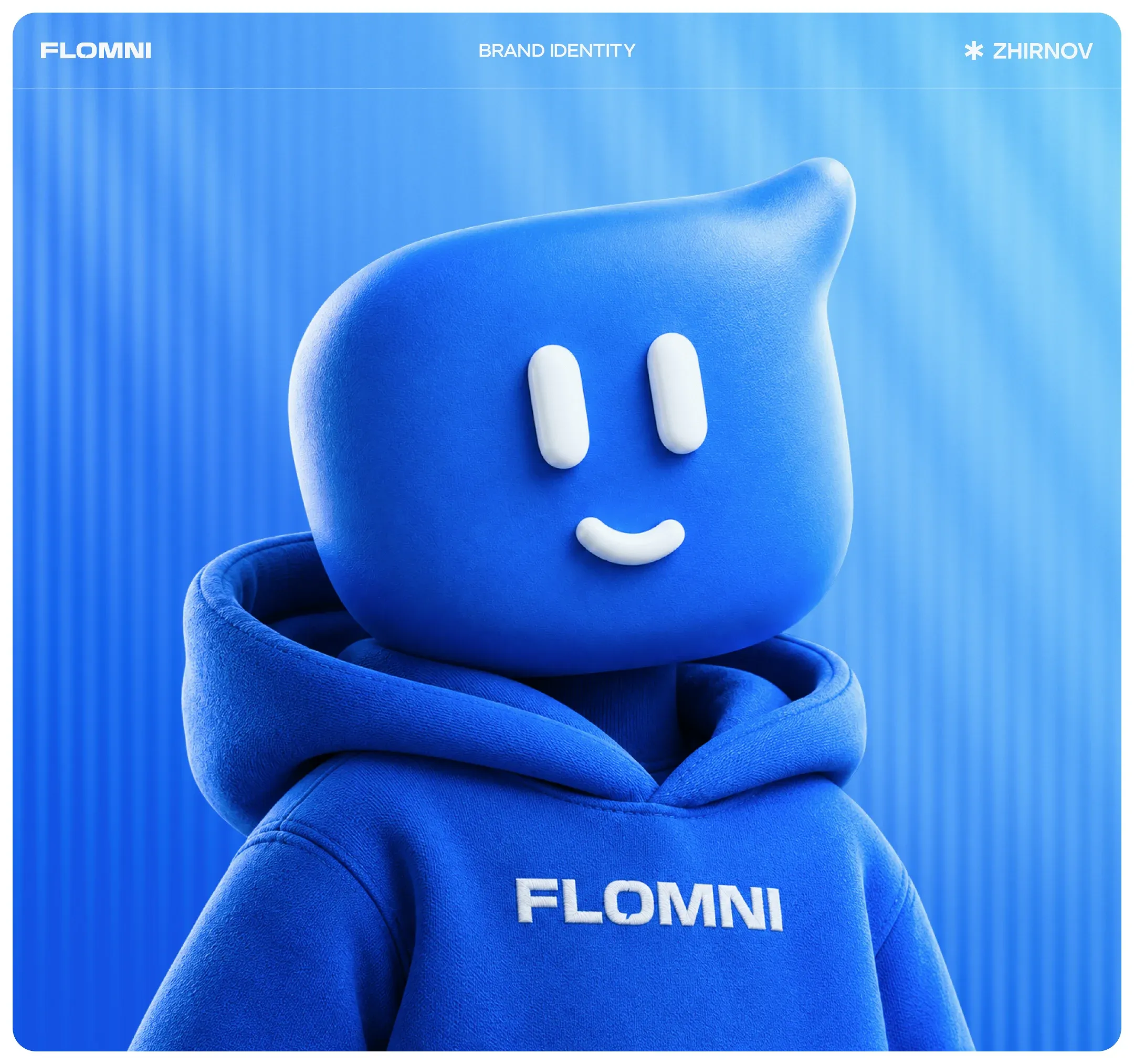
We updated the Flomni brand: developed a new logo, created a system for sub-brands, developed a mascot called the "wise friend," typefaces, merchandise and visual language. The rebrand was presented at the company's first conference.
Hello! We are ZHIRNOV, a product development studio. Our strength is complex products and big data. Finance, services, platforms, AI solutions – wherever there's a lot of logic, calculations and scenarios. We know how to make interfaces clear and lower the barrier to entry for users. Our clients include Tinkoff, Raiffeisen, Rostelecom, Flomni and startups. We start with an MVP, help the product get on its feet and grow further. We'll tell you how Flomni updated itself, got a mascot, and how we helped it do that.
Flomni is an omnichannel communications platform for business
It's a large chatbot service. It has widgets for websites, a dialogue platform, bots, newsletters, AI and everything related to communicating with customers across different channels. We've been working with Flomni for a long time, and there have been several projects during that time. It's convenient to divide them into two parts. The first is marketing: rebrand, corporate website, brand book and mascot. The second is product: the platform interface itself with a large number of sub-brands. Today we're talking about the first one.
Strong product, weak first impression
Inside – a powerful communications platform, outside – the feel of a service from the early 2000s. The scale and innovation weren't coming through. There were more and more features, but there was no cohesive brand image. A complete visual overhaul was necessary, so we got involved.
For them, it's not about marveling at the technology, but about feeling control and predictability. That's how we understood that Flomni shouldn't look all-knowing and cold. It doesn't need a "super-AI" image. On the contrary, it should be human – supportive, explanatory and taking care of things.
Moodboard: we found the brand's mood
Already at the proposal stage, we gather visual references so we can communicate without abstractions. This makes it easier to understand if we're looking in the same direction as the client.
We developed the moodboard through animation and familiar visual codes, adding a soft AI vibe and dreamcore – but without cold futurism and cyberpunk aggression. And here's what we came up with. By the way, did you notice that the mascot idea was already there at the moodboard stage? We'll tell you what it turned into a bit later.
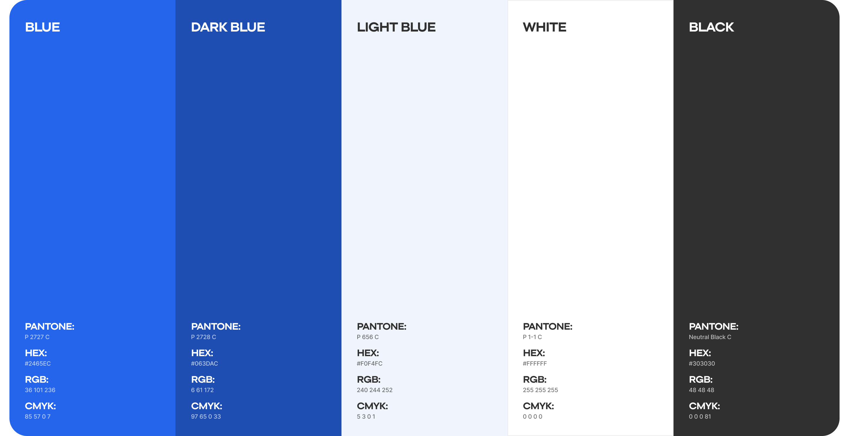
The foundation of the Flomni moodboard is blue. It was part of the service's DNA from the start, so we didn't abandon it. Instead, we reconsidered the shades: made them deeper and cleaner, preserved continuity, but removed the feeling of "that very corporate blue."
The Flomni logo becomes adaptive and scalable
The first step was to abandon the diagonal. The old logo was tilted: it was difficult to align and almost impossible to scale for sub-brands and products. Because of long names, it lost its proportions. In the new version, we aligned it horizontally. Then we looked for a shape. We tried Cyrillic and Latin, pixels, abstractions, "secret signs" – we wanted a simple and smart solution, without "obvious pictures." Our find was the letter "O." We built a loop into it – creating a dialogue bubble. This displayed the very essence of the product – dialogue, message exchange. Moreover, the letter "O" can stretch almost infinitely – in the brand book we fixed this as a technique, a symbol of continuous communication.
Fun fact: literally the day after the rebrand presentation, news came out that Lamoda also straightened its logo and abandoned diagonals. A coincidence, but a telling one – the market as a whole is moving toward simplicity and adaptive systems. And that's really cool.
In parallel, we laid out a sub-brand system. Flomni is an ecosystem, so new products should integrate easily into the brand. The solution here is: the base Flomni logo + product specification (for example, Flomni HR).
Brand visual environment
We built the Flomni visual language around soft neofuturism and without aggressive high-tech. We conveyed technology through semi-transparent 3D shapes, glowing layers. An important technique is gradients. Transitions from deep blue to light shades give airiness and also develop the brand's base color. Gradients are used both as backgrounds and as standalone elements. Separately – patterns. On screens – repeating icons, lines, dialogue elements. This is a reference to messengers and chats – what Flomni works with every day.
Iconography for a complex interface
We took a practical approach: took a library with an open license and adapted it for the product – we kept some icons, drew others by hand. An important point is adaptability. We chose a pack with flexible line thickness and scale settings so that icons remain clear in the sidebar, in settings, and in tables.
We fixed what shouldn't be in Flomni's visuals
First, we avoid images of chaos and fragmentation. The product is about order and systematicity, so no visual noise or disjointed elements. Second, no aggressive technologism. Neocyberpunk, crypto-aesthetics, android women with guns, dark AI pathos – none of that is Flomni. Third, we move away from corporate facelessness: stock photos of people in offices, handshakes at kanban boards, "the team discusses strategy." Finally, outdated automation metaphors are also off-limits: humanoid robots, gears, industrial schemes, space stations.
Settled on a typeface system
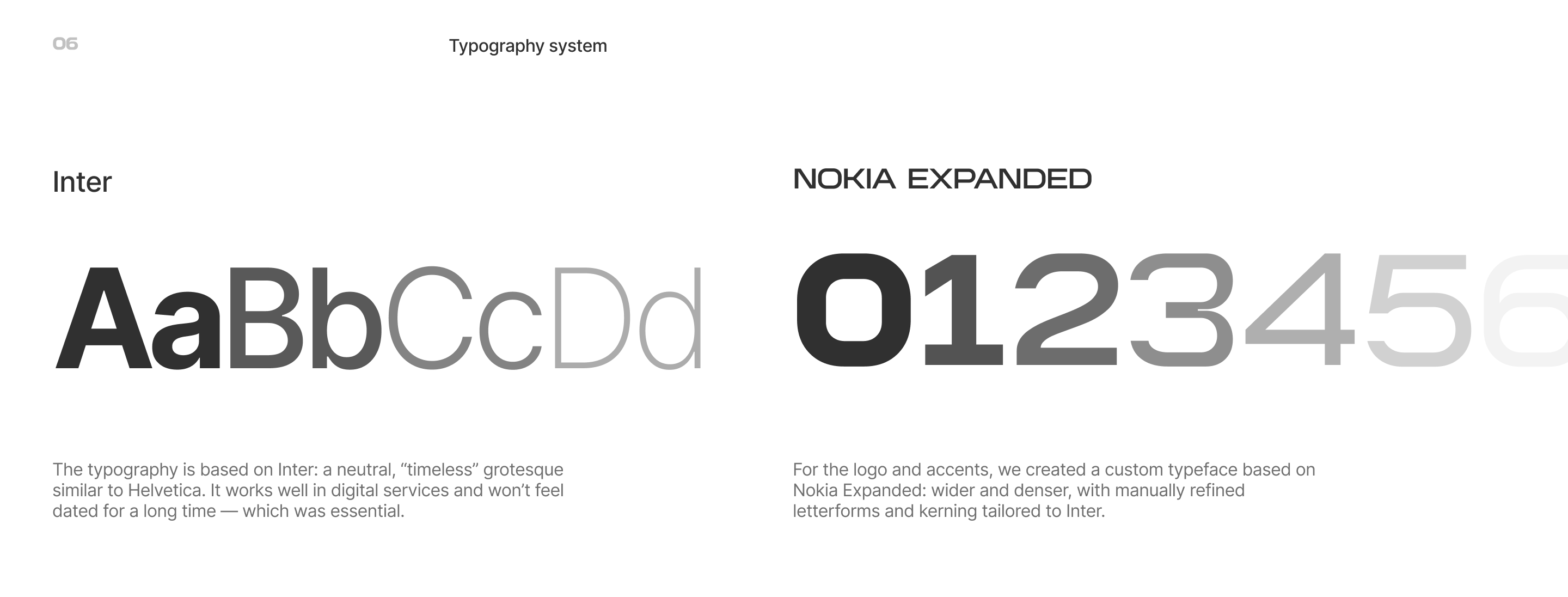
The typography is based on Inter: a neutral, "timeless" sans-serif, close to Helvetica. It works well in services and doesn't age quickly – that was essential. For the logo and accents, we used a custom typeface based on Nokia Expanded: wider and denser, with manually refined forms and kerning to match Inter.
Decided what employees would wear
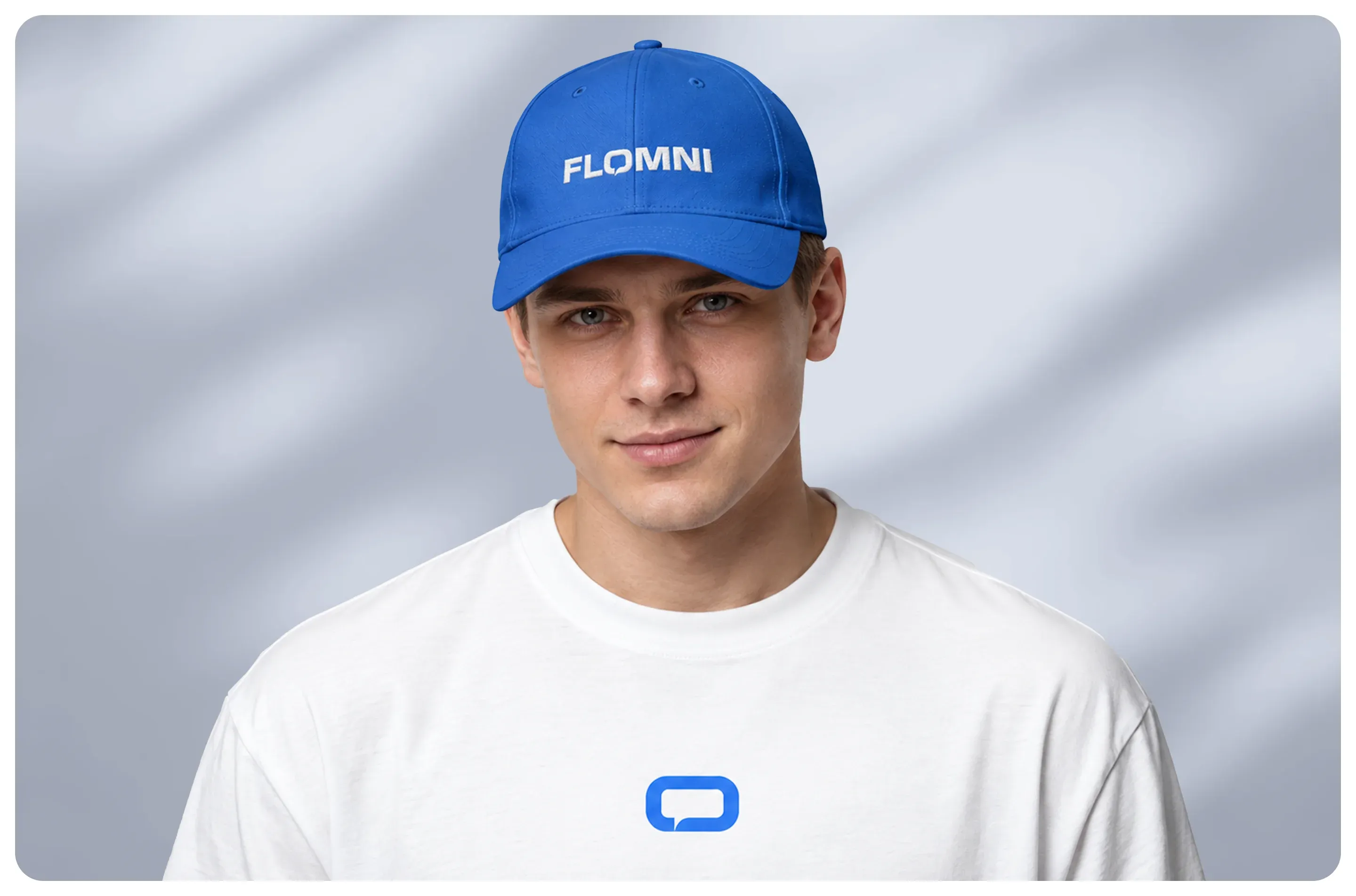
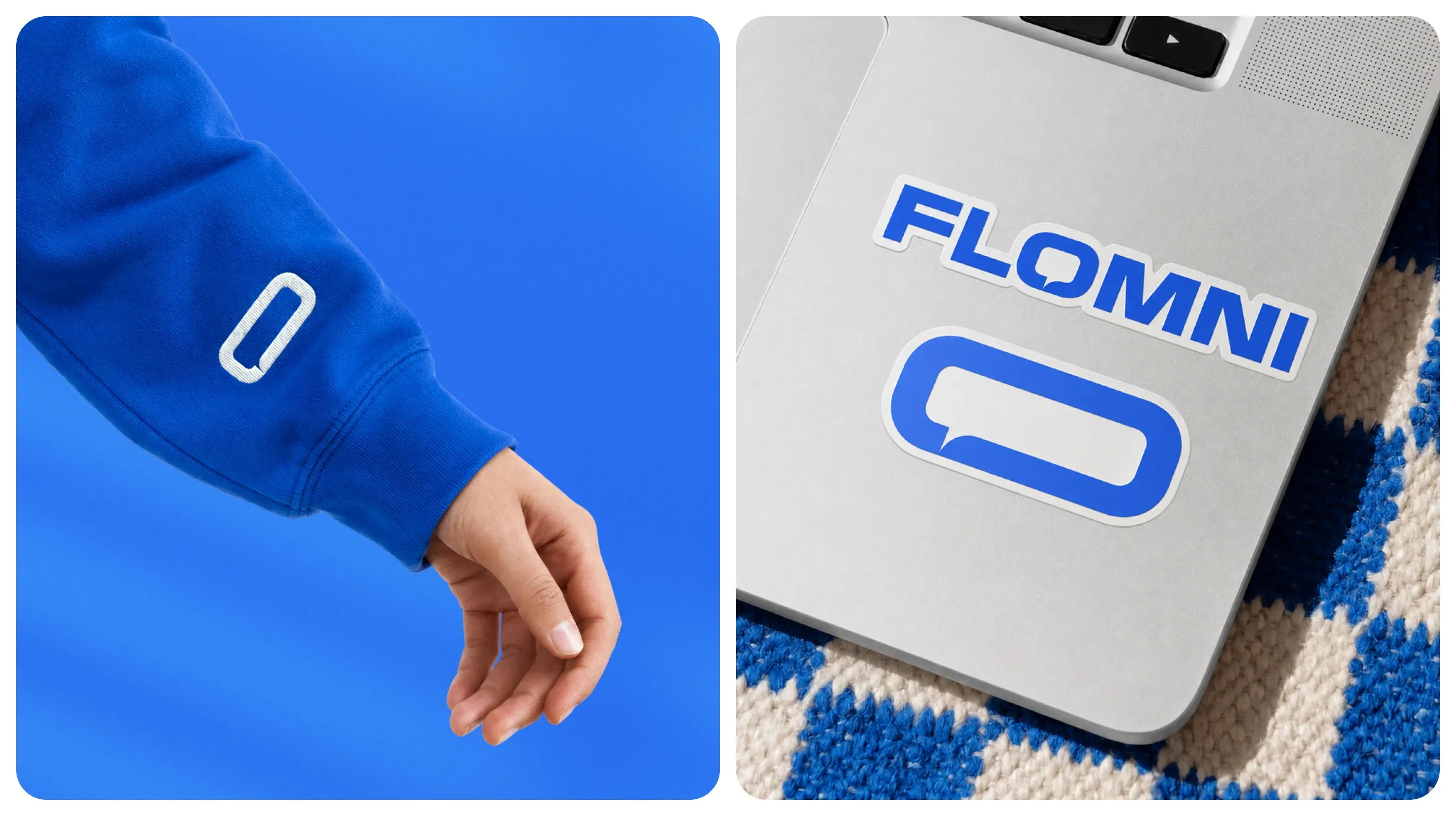
The same letter "O" works well on clothing: it looks graphic and scales easily. It can adapt in various ways to the shape, wrapping around the garment.
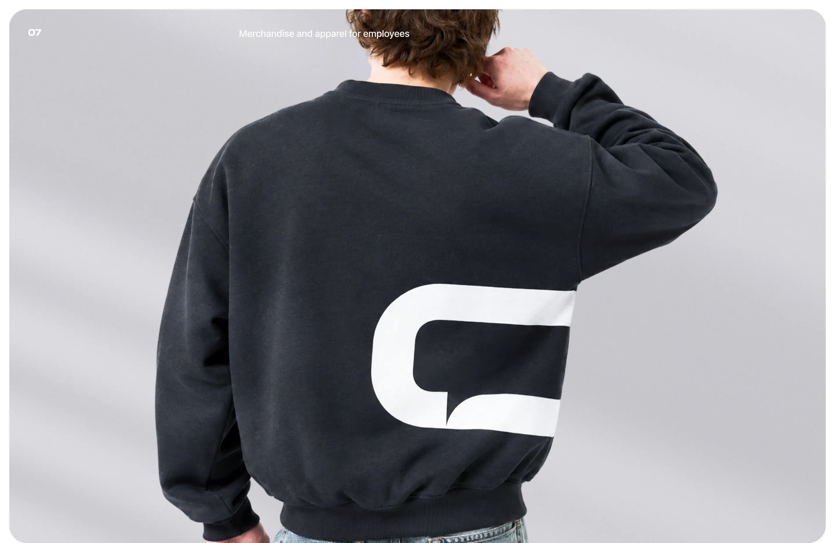
We tried different placement options – a large mark across almost the full width of the sweatshirt, neat accents on the sleeve.
Visualized the "Wise Friend"
We explored many directions – from abstractions to cartoon characters. We studied animation and NFT, but filtered out everything too cold, plastic, and soulless. There were also approaches through geometry as a metaphor for systematicity, but we lost the humanity there.
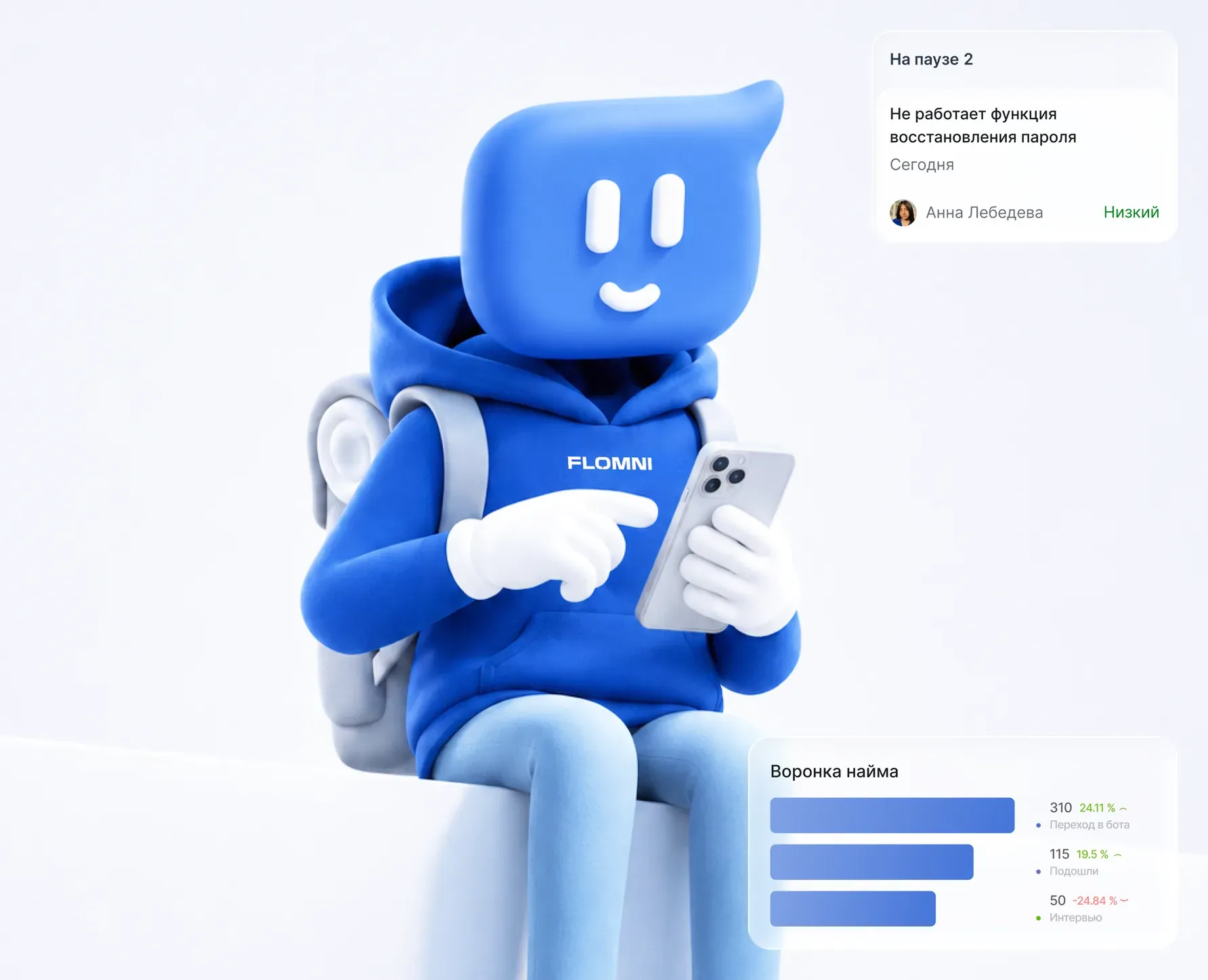
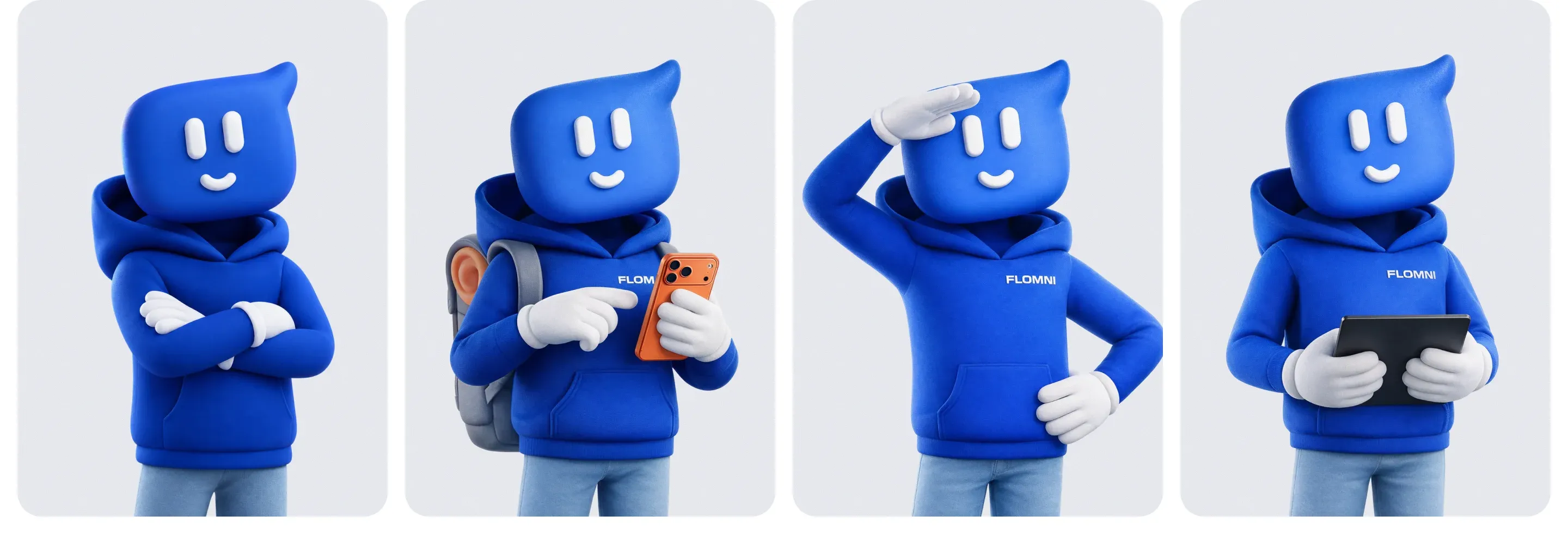
The turning point was a cloud shape as the head. Its "tail" rhymed with the logo – we started developing the technique: the tail became bangs, a face and expressions appeared. We formed the image of a "wise friend" – someone who speaks in simple language and doesn't push expertise. It became the foundation of our visual communications.
The final image is an anthropomorphic character in a blue sweatshirt, jeans, and sneakers, with lively emotions and poses. Over time, it will be animated and adapted to different scenarios. A positive and wise friend, indeed.
Found the right words
We arrived at them after the rebrand, when we felt that the brand had acquired an emotional core that was important to capture in words.
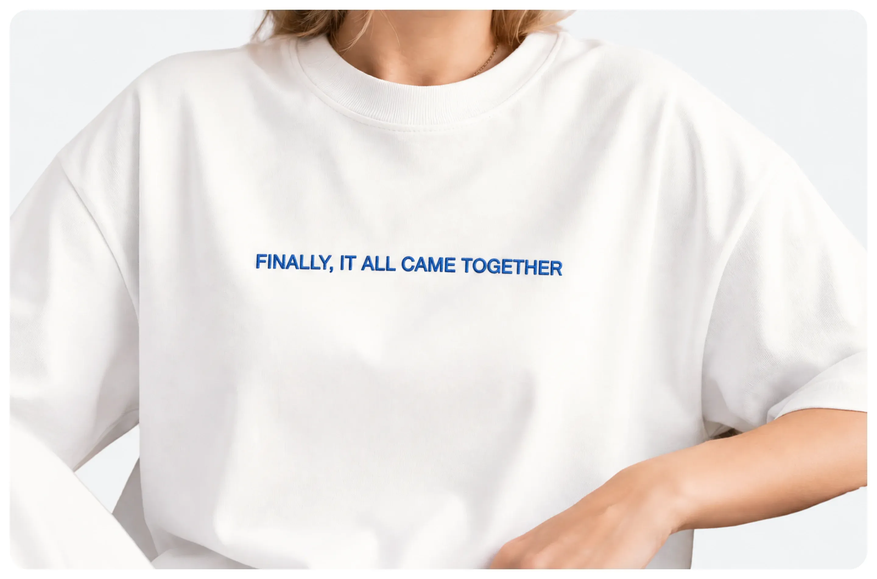
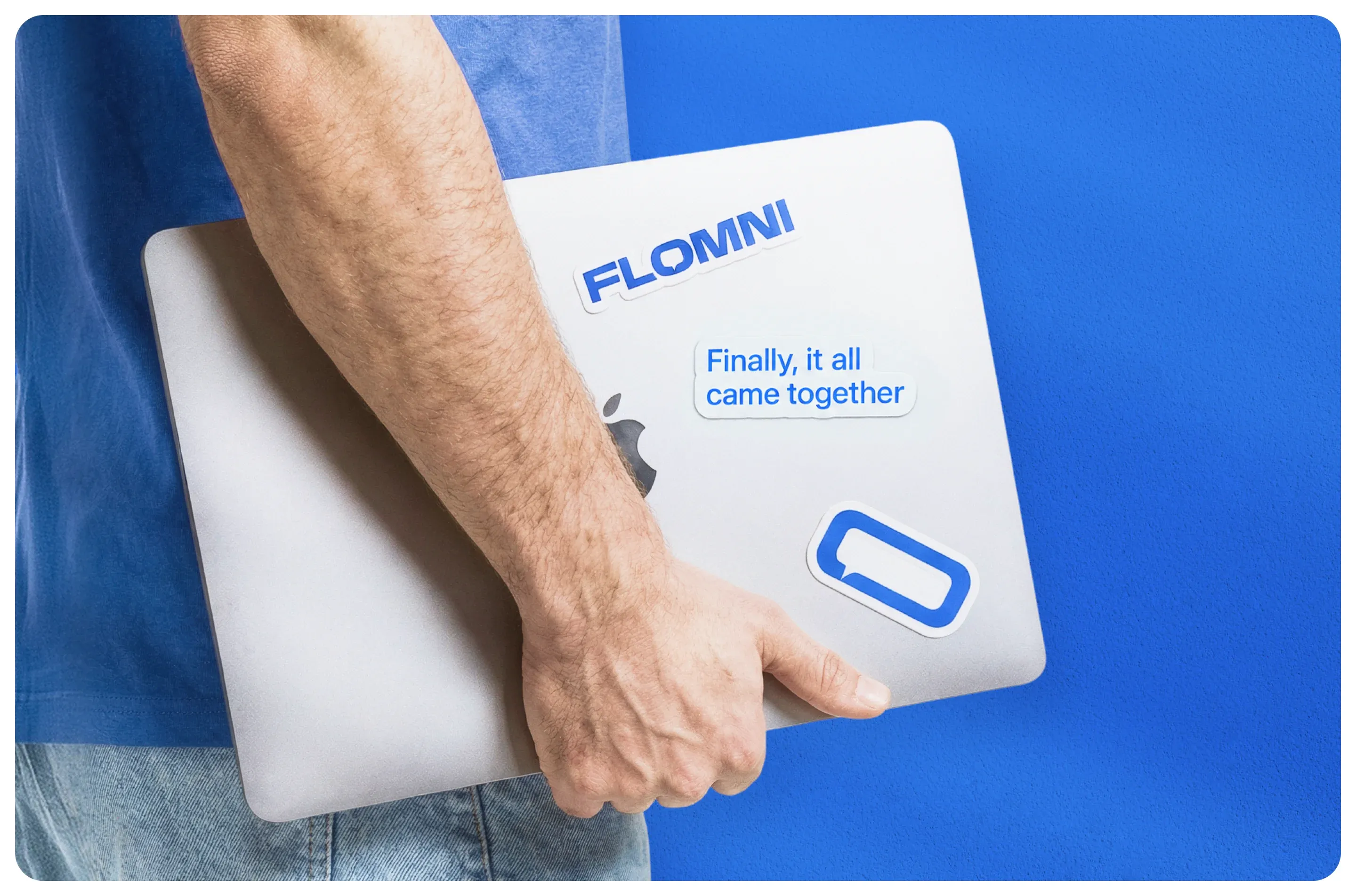
The tagline is based on a state of being. That feeling when all processes are running smoothly, integrations are set up, and the system starts working like clockwork. In that moment, both Flomni and their clients exhale: finally, everything came together.
Instead of conclusions
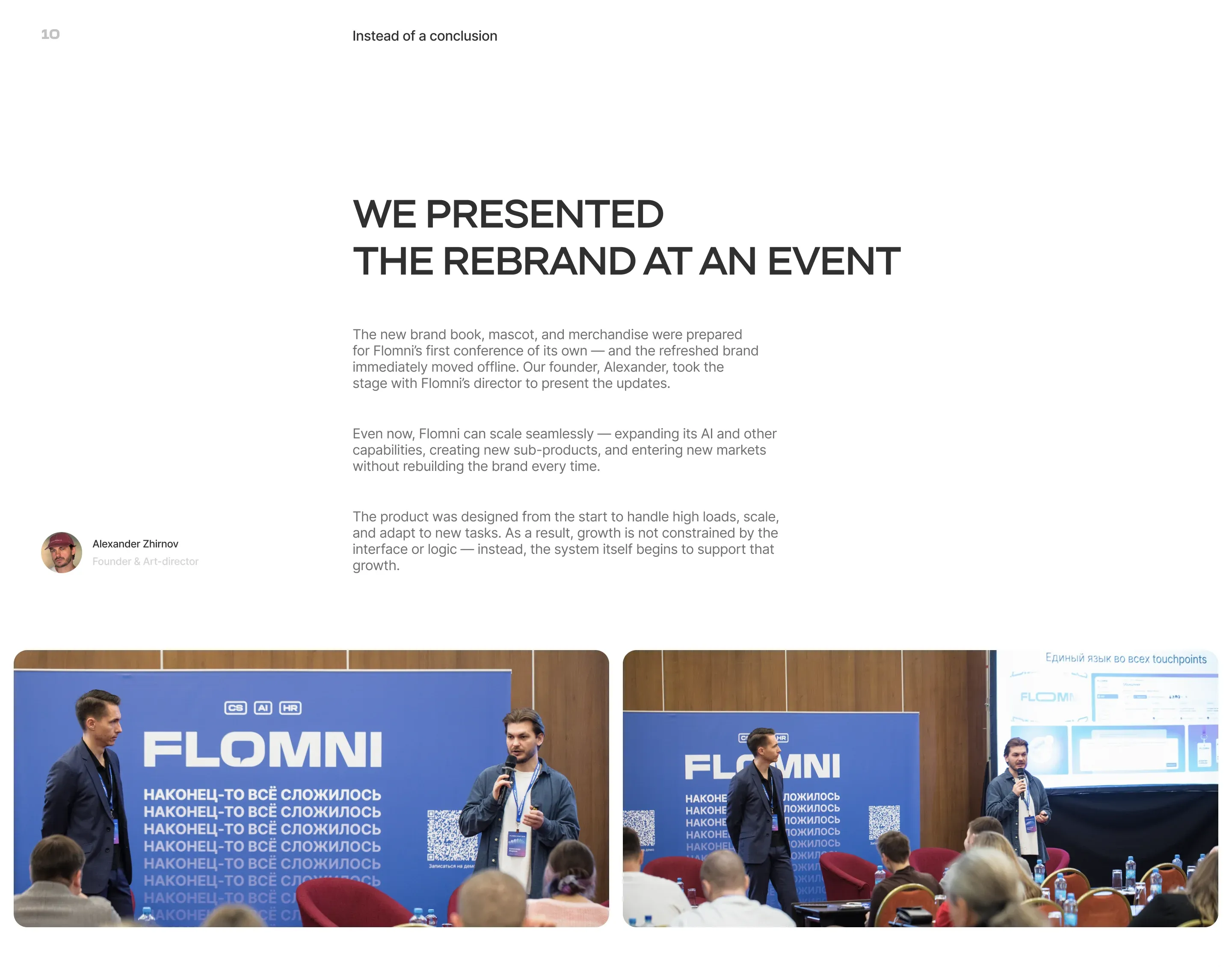
Presented at an event and unveiled the rebrand. The new brand book, mascot, and merch were being prepared for Flomni's first own conference – and the updated brand went live offline right away. Our founder, Alexander, spoke alongside Flomni's director and presented the updates.
Showing some photos :)
We're not saying goodbye – see you soon in our next story!