Ru
Ru Our channel
Kreditor: branding
A new visual language for a financial ecosystem: we reimagined the coat of arms, built a modular logo system for all business lines, and created a website with a "Mortgage Showcase". NPS grew by 60% after launch.
Kreditor grew from a local brand into a large-scale ecosystem, but the visual language didn't reflect this growth. Over six months, we created a modular identity, reimagined the heraldry, developed a website with a "Mortgage Showcase", and unified the products into a single system.
Client
Kreditor is a financial group that transformed from a local player into a large-scale ecosystem over several years. It includes investment services, a real estate agency, crowdlending, lending, MFO, and consulting services.
This was one of those cases where external changes couldn't keep up with internal transformation. Visually, the old website didn't reflect the level of technology the company had grown to, and the branding looked outdated.
Our goal was: To build a strong brand that reflects the company's values and market position.
video
Result
The redesign helped the company relaunch perception and reach a new level. The brand became perceived as modern, technological, and reliable — exactly what Kreditor is in its work.
— NPS grew by 60% after the launch of the new identity and website
— The share of qualified leads increased by 25%
— Decision-making time was cut in half, as clients now arrive with an understanding of the product
— Media positions strengthened, including the company presenting its financial product at SPIEF 2025, which we also developed
Over six months, the rebranding, modular identity, and new website helped create a unified product ecosystem, increase loyalty and lead quality, accelerate decision-making, and strengthen the brand in the market.
video
Tasks
— Create a reliable and technological brand image at all customer touchpoints, visually bringing it closer to the banking sector
— Build a website with transparent information about products and terms to address key objections before contact with a manager
— Develop a modular visual system for rapid scaling of pages, communication materials, and personal accounts
— Reimagine the brand while preserving the logo's uniqueness and build a visual foundation for uniting the group's business lines
Logo and visual system
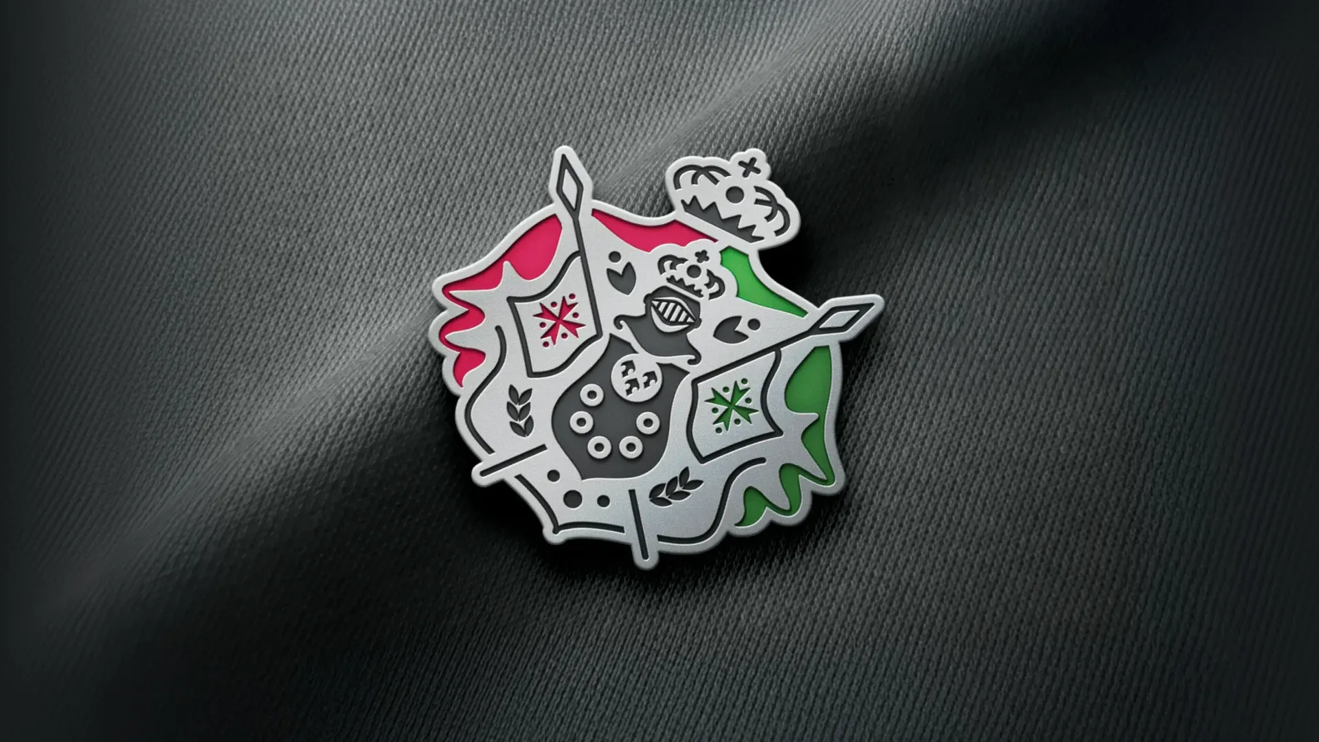
We preserved the brand's heritage by reimagining the coat of arms: simplified the form, kept key symbols, and adapted the logo for digital. It became cleaner, more modern, and still recognizable to existing clients.
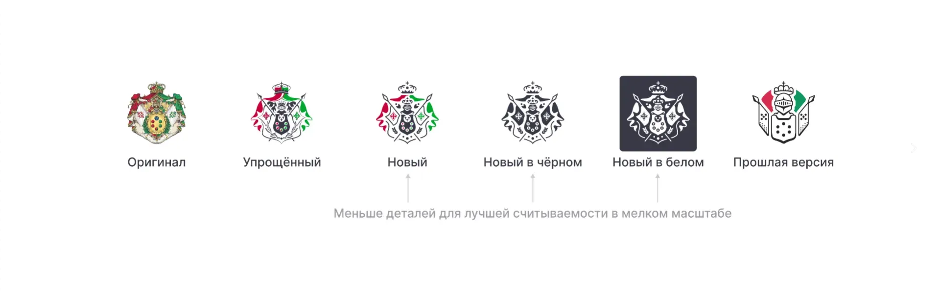
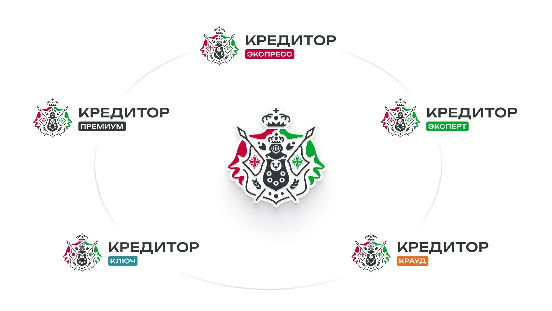
For scaling, we developed a modular logo system that unites all company lines — Express, Expert, Key, Premium, and others. This way the brand eliminated chaotic identity and brought all products into a single ecosystem.
The visual system was built on a combination of brand colors (red, white, gray, black), a clear grid, and expressive typography. 3D graphics add depth and dynamics. Thanks to this, the style works equally confidently in digital, offline, and marketing materials.
video
We designed a complete set of applications — from business documents and presentations to merch and social media, and also prepared a brandbook, logobook, and guidelines for scaling without quality loss.
video
Website development
We designed the website as an information base for investors. Each product is presented as a separate page in the main menu with an explanation of its value, which confirms the scale and stability of the business to the audience.
The foundation is PHP + WordPress with Gutenberg blocks and Bitrix integration. We created a unified UI system that allows rapid scaling of new pages, creating landing pages, and even new websites.
video
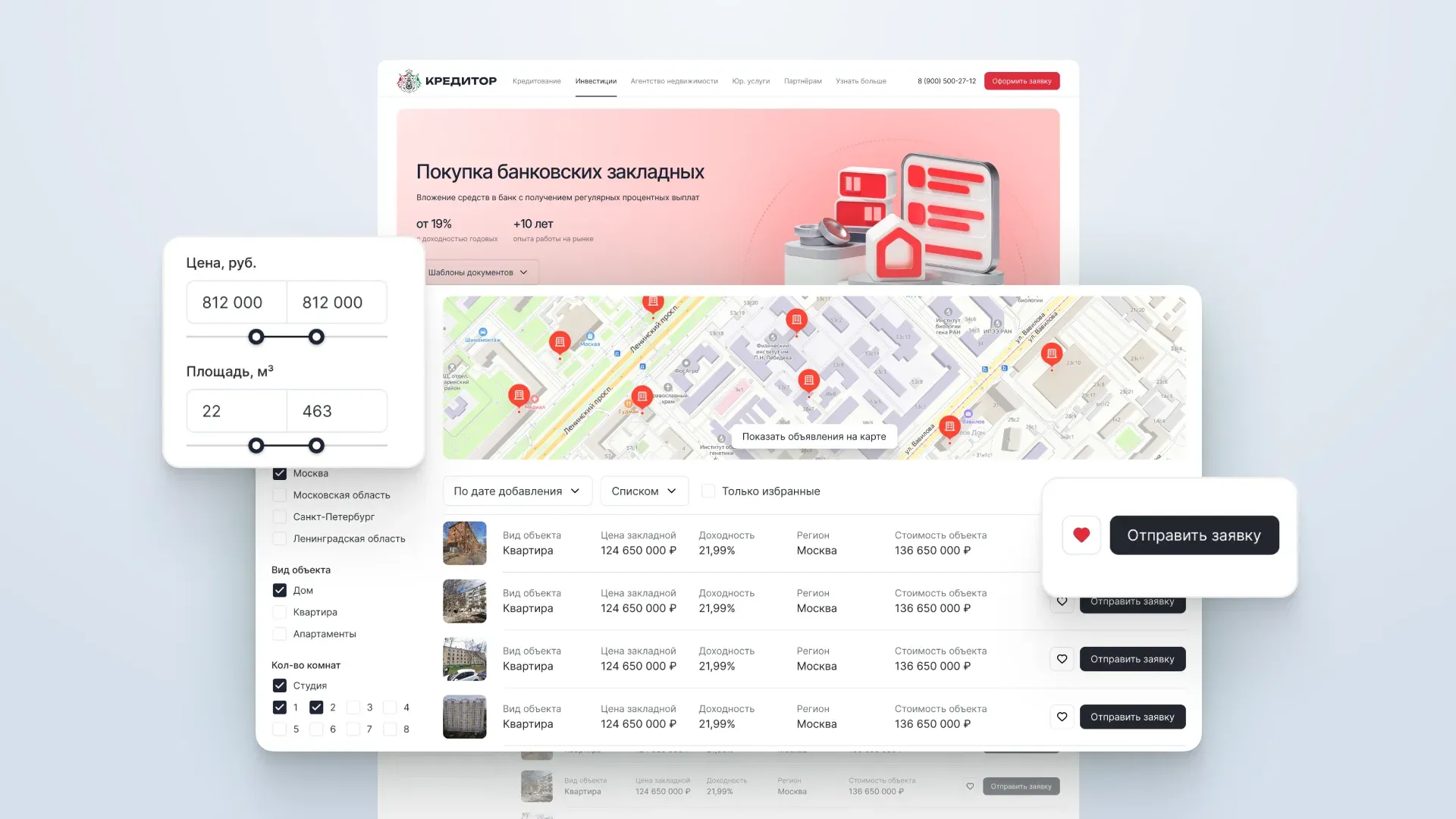
The key tool is the "Mortgage Showcase": current investment properties with filters by type, term, and yield, and the ability to submit an application.
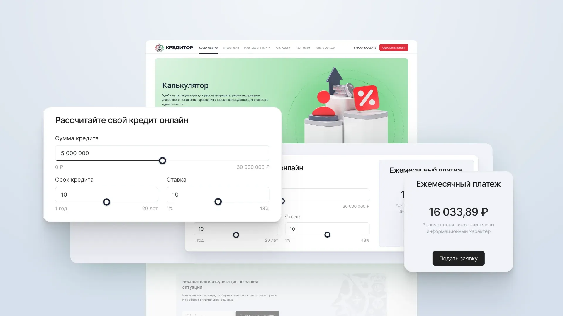
Additionally, calculators are built in (calculating deposit yields, loan payment amounts, and refinancing programs), available both on pages and in a separate section, which facilitates analysis and reduces the load on managers.
The redesign and new visual system allowed Kreditor to look modern, technological, and inspire investor confidence. At ZHIRNOV Studio, we create design and digital products for FinTech, IT, SaaS, and e-commerce that help businesses grow and be understood by their audience.
Read redesign breakdown on vc.ru →